...
- Click the Label cell for the first class that reads "≤50000" and type "$0 - $50,000." Press Enter.
- Click the Label cell for the second class that reads "≤90000" and type "$50,001 - $90,000." Press Enter.
- Click the Label cell for the third class that reads "≤150000" and type "$90,001 - $150,000." Press Enter.
- Click the Label cell for the fourth class that reads "≤250001" and type "$150,001 - $250,001." Press Enter.

Editing Class Symbology
- Click the More drop-down menu to the top right of the Upper value table.
- Under Symbols, click Format all symbols.

- At the top of the pane, note how Gallery is selected by default. Select Properties.
- Expand the Appearance drop-down section.
- Click on the color box associated with Outline color.
- Hover over the colors until the labels appear, and select Gray 80%.
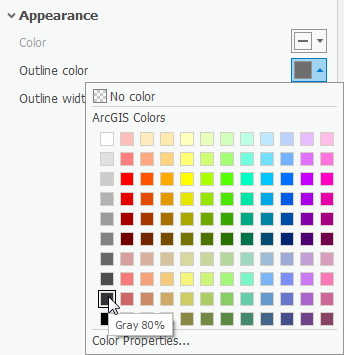
- Click on the color box associated with the Outline color again.
- At the bottom of the pane, select Color Properties...
- In the pop-up Color Editor box, change the Red, Green, and Blue values to 60.
- Make sure the HEX # is 3C3C3C and click OK.

- Change the Outline width to 0.5 pt.
- At the bottom of the pane, click Apply.
In the Contents pane to the left, notice that there is a Legend-like display for the BlockGroupCensusData layer.
- Right-click the color box next to the $0 - $50,000 field. Notice that a color drop-down menu appears.
- Hover over the colors until the label appears, and select Gray 10%.
- Right-click the color box next to the $50,001 - $90,000 field. Select Gray 30%.
- Right-click the color box next to the $90,001 - $150,000 field. Select Gray 50%.
- Right-click the color box next to the $150,001 - $250,001 field. Select Gray 70%.
On the Contents pane to the left, notice that under the BlockGroupCensusData layer name, there is a subtitle of the field symbolized upon that reads MEDIAN_HOUSE_INCOME.
- Click the MEDIAN_HOUSE_INCOME title twice until the text is editable.
Type "Median Household Income by Census Block Group." Hit Enter.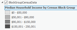
...
Establishing the Layout
Creating the Layout
- In the Insert ribbon, in the Project Group, click New Layout.
- At the bottom of the drop-down menu, select Custom page size...
- In the General tab on the pop-up Layout Properties box, type "Median Household Income by Census Block Group" in the Name field.
- Click the Page Setup tab to the left. Notice how the default 8.5" x 11" page size is selected.
- Change the Width to 5.
- Change the Height to 4.
- At the bottom of the pop-up, click OK.
A new Layout opens. Notice how a new Layouts folder has appeared in the Catalog pane with this Layout in it.
- On the Insert ribbon, click the Map Frame title with the drop-down arrow.
- Select the frame that contains the "Median H..." name.

- Right-click the 0" mark on the horizontal ruler at the top of the Layout. Select Add Guide.
- At the 5" mark on the horizontal ruler, right-click and select Add Guide.
- Repeat at the 0" and 4" marks on the vertical ruler.
- Select the Map Frame in the center of the Layout. Click and drag the corners to snap to the guides on the corner of the Layout.
- In the Contents pane to the left, expand the Map Frame layer. Expand the original map Median Household Income by Census Block Group layer.
- Right-click on the BlockGroupCensusData layer and select Zoom To Layer.
Now it is time to customize the zoom of the layout.
- In the Layout ribbon, in the Map group, click the Activate button. Notice that now the map itself is editable within the layout.
- Hold down Shift and notice that your mouse changes to a Zoom In magnifying glass.
- Click and drag a box around Harris County with boundaries as close to the edge of the data as possible. Release to zoom in.
- Drag the map up so that there is an inch of space at the bottom of the Layout for a legend to be placed.
- At the top of the Map View, click the back arrow at the left or the red X to the right to exit out of Activation.

...
- In the Insert ribbon, in the Text group, click the drop-down arrow next to Dynamic Text.
- Scroll to the bottom, and within the Layout group, select Service Layer Credits.

This makes the Esri service layer credits for the basemap into a dynamic text box.
- Drag the service layer credits off of the Layout.
- In the Insert ribbon, in the Map Surrounds group, click the North Arrow drop-down menu.
- Select the middle arrow in the first row.
The arrow is added directly to the center of your layout, so it may be difficult to see.
- Move the North Arrow to the lower right corner of the map.
- In the Contents pane, click on the North Arrow layer. the The Format North Arrow pane pops up on the right.
- Under the North Arrow drop-down menu, select Point Symbol.
- Click the color box associated with the Color field. Select Gray 50%. Click Apply.

- In the Insert ribbon, in the Map Surrounds group, click the Scale Bar drop-down menu.
- Select Alternating Scale Bar 1.
- Drag the scale bar down to the middle bottom of your layout. Drag Resize the scale bar to the right to resize it until you can see the numbers clearly.
- Notice that the Format Scale Bar pane has popped up to the right. Instead of Scale Bar, select Text Symbol to the top.
- Under Size, choose 8 pt. Under the Color box, choose Gray 50%. At the bottom, click Apply.
- Click the Scale Bar drop-down menu. Select Background. Under Outline Color, right-click the associated color box and choose Gray 50%.
- Click the Scale Bar drop-down menu. Repeat changing the colors to Gray 50% for the Background, Shadow, Numbers, Units, Symbol 1, and Symbol 2.
- In the Contents pane to the left, click the Map Frame layer.
- In the Format Map Frame pane to the right, click the Map Frame drop-down menu. Select Border.
- Change the Color to No color and select Apply.
Adding a Legend
- In the Insert ribbon, in the Map Surrounds group, click Legend.
- Drag and release a large rectangle around the blank space at the bottom of the map to place the Legend.

- In the Contents pane, click on the Legend layer.
- In the Format Legend pane to the right, under the Legend Items section, click the Show properties... button.
- Under the Show list, uncheck Layer name.
- Resize the Legend box so that it fits in the space provided.

- If you are still in the Format Legend Item pane, click the top left back arrow in the pane.
- Under the Legend drop-down menu, select Headings. Expand Appearance.
- Change the Color to Gray 80% and click Apply.
- Under the Legend drop-down menu, select Labels.
- Change the Color to Gray 80% and click Apply.
Export
- In the Share ribbon, in the Export Group, click the Layout button with the green arrow.

- Navigate to your LayoutTutorialData folder on the Desktop.
- Make sure the Save as type is TIFF (*.tif) and the Resolution (DPI) is set to 600.
- Click Export.