...
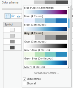
- Click the Color scheme drop-down menu.
- At the bottom of the menu, select "Show names."
- Scroll down the Color scheme menu and select Grays (4 Classes).

Now, we will make sure to manually customize the values in each class before changing the colors so we know exactly how many blocks have these colors before changing the colors. Observe the Upper value column in the Symbology pane. Right now, the Method is set to Natural Breaks (Jenks), which is ArcGIS's default algorithmic way to decide the class split. Unless you have a specific way you want to divide the data, my default recommendation is to use Natural Breaks and round the data to the nearest whole number that makes sense.
...
- Click the More drop-down menu to the top right of the Upper value table.
- Under Symbols, click Format all symbols.

- At the top of the pane, note how Gallery is selected by default. Select Properties.
- Expand the Appearance drop-down section.
- Click on the color box associated with Outline color.
- Hover over the colors until the labels appear, and select Gray 80%.
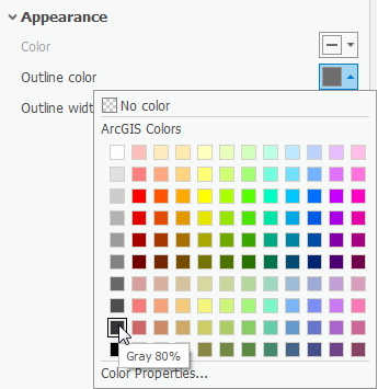
- Click on the color box associated with the Outline color again.
- At the bottom of the pane, select Color Properties...
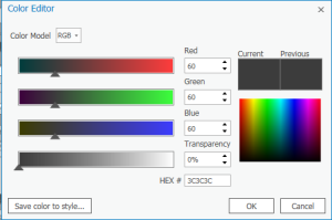
- In the pop-up Color Editor box, change the Red, Green, and Blue values to 60.
- Make sure the HEX # is 3C3C3C and click OK.

- Change the Outline width to 0.5 pt.
- At the bottom of the pane, click Apply.
...
- In the Layout ribbon, in the Map group, click the Activate button. Notice that now the map itself is editable within the layout.
- Hold down Shift and notice that your mouse changes to a Zoom In magnifying glass.
- Click and drag a box around Harris County with boundaries as close to the edge of the data as possible. Release to zoom in.
- Drag the map up so that there is an inch of space at the bottom of the Layout for a legend to be placed.
- At the top of the Map View, click the back arrow at the left or the red X to the right to exit out of Activation.


Adding Map Surrounds
...
- In the Insert ribbon, in the Map Surrounds group, click Legend.
- Drag and release a large rectangle around the blank space at the bottom of the map to place the Legend.


- In the Contents pane, click on the Legend layer.
- In the Format Legend pane to the right, under the Legend Items section, click the Show properties... button.
- Under the Show list, uncheck Layer name.
- Resize the Legend box so that it fits in the space provided.


- If you are still in the Format Legend Item pane, click the top left back arrow in the pane.
- Under the Legend drop-down menu, select Headings. Expand Appearance.
- Change the Color to Gray 80% and click Apply.
- Under the Legend drop-down menu, select Labels.
- Change the Color to Gray 80% and click Apply.
...