...
Before beginning the tutorial, you will copy all of the required tutorial data onto your Desktop. Option 1 is best if you are completing this tutorial in one of our short courses or from the GIS/Data Center and Option 2 is best if you are completing the tutorial from your own computer.
OPTION 1: Accessing tutorial data from Fondren Library using the gistrain profile
If you are completing this tutorial from a public computer in Fondren Library and are logged on using the gistrain profile, follow the instructions below:
- On the Desktop, double-click the Computer icon > gisdata GISData (\\file-rnassmb.rdf.rice.edu\research\FondrenGDC) (RO:) > > GDCTraining > 1_Short_Courses > > Measuring_Geographic_Distributions.
- To create a personal copy of the tutorial data, drag the GeographicDistribution folder onto the Desktop.
- Close all windows.
...
| Info | ||
|---|---|---|
| ||
- Click GeographicDistribution.zip above to download the tutorial data.
- Open the Downloads folder.
- Right-click GeographicDistribution.zip and select Extract All....
- In the 'Extract Compressed (Zipped) Folders' window, accept the default location into the Downloads folder and click Extract.
- Drag the unzipped XY folder onto your Desktop.
- Close all windows.
...
- On the Desktop, double-click the GeographicDistribution folder.
- Double-click the GeographicDistribution.aprx project file to open the project in ArcGIS Pro.
Central Feature
...
- .
...
- In the Catalog pane on the right, expand the the Databases folder folder.
- Expand the the GeographicDistribution.gdb geodatabase.
- Right-click the USStatesPopTimeline the USStatesPopTimeline feature class and and select Add to New Map.
You may wish to zoom into the continental United States.
- In the Contents pane to the left, right-click the USStatesPopTimeline layer and select the USStatesPopTimeline layer name and select Attribute Table.
Notice that the attribute table contains population data every decade between 1790 and 2010 for each of the 50 states and the District of Columbia. These population counts only include only people counted in the official US Census, meaning native populations and populations of territories, among others, are not included.
- Close
the - the USStatesPopTimeline table view.
...
You will now investigate how the distribution of the population of the United States has changed over time using geographic distribution tools, which calculate the spatial equivalent of summary statistics.
Opening the Geoprocessing Pane
- On the ribbon, click the Analysis tab.
- On the Analysis tab, within the first Geoprocessing group, click the Tools button.

Notice that the Geoprocessing pane has opened on the right as a new tab on top of the Catalog pane. Typically, you would use the 'Find Tools' search box at the top of the Geoprocessing pane to search for the name of the tool you'd like to use, but, at times, especially when learning the software, it can be helpful to view the full hierarchy of all the tools available, because you will often discover related and helpful tools that you didn't know existed and wouldn't know to search for. You might also completely forget the name of a tool, but be able to locate it based on the hierarchy. For these reasons, we will be manually navigating the toolboxes throughout this tutorial. The more typical workflow of searching directly for a specific tool is covered at the end of the the Introduction to Geoprocessing tutorial tutorial.
- At the top of the Geoproccessing pane, click the Toolboxes tab.
Central Feature
The first tool you will learn is the Central Feature tool, which will identify the most centrally located feature in a point, line, or polygon feature class. You will run the tool three times, weighting the central feature by the population in 1790, 1870, and 2010 to see how the country expanded to the west.
1790
You will start by determining which state is most centrally located out of all the states admitted as of 1790 when weighted by the 1790 population.
- In the Geoprocessing pane, clickClick the Spatial Statistics Tools toolbox > Measuring Geographic Distributions toolset > Central Feature tool.
- For ‘Input Feature Class’, use the drop-down menu, select the USStatesPopTimeline layer.
- For ‘Output Feature Class’, rename the feature class from USStatesPopTimeline_CentralF to class "USStatesPopTimeline_CFCentralFeature_1790".
- For ‘Weight Field,’ use the drop-down menu to select the Pop1790 field.
- Ensure your Central Feature tool parameters are configured as shown below and click Run.

Notice that the output of this tool is the polygon state of Maryland, which was one of the existing features from the original USStatesPopTimeline layer. This state selection makes intuitive sense, since Maryland is located near the center of the original US colonies and is adjacent to the nation's capital.
...
- For ‘Output Feature Class’, rename the feature class "USStatesPopTimeline_CentralFeature_1870".
- For ‘Weight Field,’ use the drop-down menu to select the Pop1870 field.
- Ensure your Central Feature tool parameters are configured as shown below and click Run.
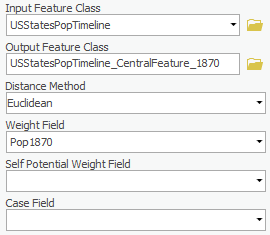
Result The resulting feature is Ohio, which is west of Maryland, as we would expect.
2010
- For ‘Output Feature Class’, rename the feature class "USStatesPopTimeline_CentralFeature_2010".
- For ‘Weight Field,’ use the drop-down menu to select the Pop2010 field.
- Ensure your Central Feature tool parameters are configured as shown below and click Run.
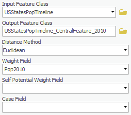
The Central Feature tool is useful for finding the center when you want to minimize distance (Euclidean or Manhattan distance). If you open the attribute table of each outcome, we could see that from the year of 1790, 1870 to 2010. The center moved from Maryland to Ohio to Illinoisresulting feature is Illinois. Think about what a different picture the weighted central feature paints compared to simply mapping which states were admitted in every decade. While we would expect the unweighted central feature to be a state such as Kansas, the weighted central feature, Illinois, is significantly northeast of Kansas, despite Alaska and Hawaii to the far west being included in the analysis. This discrepancy is due to the dense population on the East Coast compared to most of the rest of the country.
Mean Center
The mean center is similar to the central feature, but the tool will plot the average x and y coordinate of all the features states in the study area . It's as a point, rather than selecting an existing state polygon. The mean center is useful for tracking changes in the distribution over time or for comparing the distributions of different types of features.
...
- At the top of the Geoprocessing pane, click the Back arrow button.
- Within the Measuring Geographic Distributions toolset, click the Mean Center tool.
- For ‘Input Feature Class’, use the drop-down menu to select the USStatesPopTimeline layer.
- In ‘Output Feature Class,’ rename the feature class "USStatesPopTimeline_MeanCenter_1790".
- For ‘Weight Field,’ use the drop-down menu to select the Pop1870Pop1790 field.
- Ensure your Mean Center tool parameters are configured as shown below and click Run.
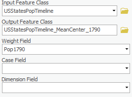
The Mean Center tool creates a new point feature class where each feature represents a mean center (one for each case when a case field is specified). The x and y mean center values, case, and mean dimension field are included as output feature attributes.
Unlike the Central Feature tool, the Mean Center tool pinpoints the specific point which could show the centralization of all states’ population in the year of 1790.
Standard Distance
In this case, the mean center is located within the central feature for the same year, but that does not always happen.
Standard Distance
The standard distance displays the spatial dispersion of data locations on a map, centered on the mean center, similar to how the standard deviation of numeric data describes the dispersion of data values centered on the mean valueYou may hear of the standard deviation within a dataset, but if you want to measure the compactness of a distribution in a map, the following tool would come as handy.
1790
- At the top of the Geoprocessing pane, click the Back arrow button.
- Within the Measuring Geographic Distributions toolset, click the Standard Distance tool.
- For ‘Input Feature Class’, use the drop-down menu to select the USStatesPopTimeline layer.
- In ‘Output Standard Distance Feature Class’, rename the feature class "USStatesPopTimeline_StandardDistance_1790".
- For ‘Circle Size’, use the drop-down menu to select 1 standard deviation.
- For ‘Weight Field,’ use the drop-down menu to select the Pop1790 field.
- Ensure your Standard Distance tool parameters are configured as shown below and click Run.

2010
The result is a circle centered on Maryland. Because this circle represents one standard distance of the 1790 population, we estimate that 68% of the US population lives within that circle in 1790.
2010
- For ‘Output Standard Distance Feature Class’, rename the feature class Rename the ‘Output Feature Class’ menu "USStatesPopTimeline_StandardDistance_2010".
- In For ‘Weight Field,’ use the drop-down menu to select the Pop2010 field.
- Leave other fields as default.
- Ensure your Standard Distance tool parameters are configured as shown below and click Run.
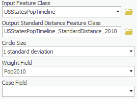
From the output, we can see comparing to 1790, the population distribution of 2010 become less compactIn comparing the 2010 standard distance to the 1790 standard distance, you can see how much more widely distributed the population has become.
Directional Distribution (Standard Deviational Ellipse)
Besides In addition to the compactness distribution of the distributionpopulation, we can choose to find the directional trend, which calculate calculates the standard distance separately in the x and y directions. These two measures define the axes of an ellipse encompassing the distribution of features, which is referred to as the standard deviational ellipse. The ellipse allows you to see if the distribution of features is elongated and hence has a particular orientation.
...
- At the top of the Geoprocessing pane, click the Back arrow button.
- In the search bar, search for ‘Directional Distribution. Select Within the Measuring Geographic Distributions toolset, click the Directional Distribution (Standard Deviational Ellipse) (Spatial Statistics Tools) tool.
- For the ‘Input Feature Class’, use the drop-down menu , to select the USStatesPopTimeline layer.In
- For ‘Output Ellipse Feature Class’, rename the layer ‘USStatesPopTimelinefeature class "USStatesPopTimeline_DirectionalDistribution1_1790’1790".
- For ‘Circle ‘Ellipse Size’, use the drop-down menu to select 1 standard deviation.
- For ‘Weight Field,’ use the drop-down menu to select the Pop1790 field.
- Ensure your Directional Distribution tool parameters are configured as shown below and click Run.

Notice how closely the ellipse follows the shape of the northeastern states and how little of the ellipse intersects with the ocean, where no one would be living, compared to the standard distance for the same year.
1790-2SD
- For ‘Output Ellipse Feature Class’, rename the feature class "USStatesPopTimeline_DirectionalDistribution2_1790".
- For ‘Ellipse Size’, use the In the ‘Ellipse Size’ drop-down menu , change to 2 standard to select 2 standard deviations.
- In ‘Weight Field,’ make sure Pop1790 is selected.
- Ensure your Directional Distribution tool parameters are configured as shown below and click Run.
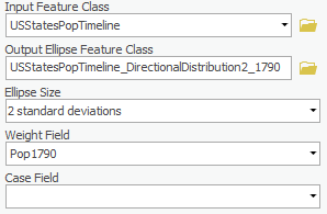
Again, notice how closely the ellipse follows the shape of the East Coast. Because this ellipse represents 2 standard deviations, we estimate that 95% of the US population lived within this ellipse in 1790.
2010-1SD
- Rename the For ‘Output Ellipse Feature Class’ ‘USStatesPopTimeline, rename the feature class "USStatesPopTimeline_DirectionalDistribution1_2010’2010".
- In For ‘Ellipse Size’, select 1 standard use the drop-down menu to select 1 standard deviation.
- In For ‘Weight Field,’ use the drop-down menu to select the Pop2010 field.
- Ensure your Directional Distribution tool parameters are configured as shown below and click Run.
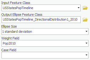
Again, in 2010, the directional distribution ellipse is much better fit to the shape of the US than the standard distance circle, which extends far into Canada and the Gulf of Mexico.
2010-2SD
- Rename the For ‘Output Ellipse Feature Class’ ‘USStatesPopTimeline, rename the feature class "USStatesPopTimeline_DirectionalDistribution2_2010’2010".
- In For ‘Ellipse Size,’ change to 2 standard Size’, use the drop-down menu to select 2 standard deviations.
- In ‘Weight Field,’ select Pop2010.
- Ensure your Directional Distribution tool parameters are configured as shown below and click Run.

At two standard deviations, the ellipse no longer appears to represent the shape of the US very well. That is because Alaska and Hawaii are two geographic outliers far to the west. You can see that the trend from the population distribution of 1790 to 2010what a dramatic effect these outliers have on the results, so you will need to carefully evaluate whether or not to exclude geographic outliers from your analysis when using this tool.
Linear Directional Mean
The trend for a set of line features is measured by calculating the average angle of the lines. The statistic used to calculate the trend is known as the directional mean. The Linear Directional Mean tool lets you calculate the mean direction or the mean orientation for a set of line.
Roads
linear directional mean calculates the average length and average direction, or angle, of a set of lines. A typical application of this tool might be to illustrate the average magnitude and direction of wind or ocean currents. Much like the other geographic distribution tools, the linear directional mean is most informative when compared over time or between variables.
Roads
- At the bottom of the Geoprocessing pane, click the Catalog tab.
- In the GeographicDistributionData geodatabase, right-click the HoustonFreewaysDissolved feature class and select Add To New Map.
- Right-click the InnerLoopRoadsDissolved feature class and select Add To Current Map.
Road data is typically segmented such that the length of road between each pair of intersections is a separate feature. In this tutorial, we are asking what is the average length of roadway with a single name, so the road layer was previously dissolved on the road name field, such that all road segments with the same name were merged into a single feature. The roads layer was also clipped to approximately the extent of the Inner Loop.
- At the bottom of the Catalog pane, click the Geoprocessing tab.
- At the top of the Geoprocessing pane, click the Back arrow button.
- Within the Measuring Geographic Distributions toolset, click the Linear Directional Mean tool
- Click the X on the top right corner of the Geoprocessing pane.
- In the Catalog pane, expand the Databases folder, and expand the GeographicDistributionData geodatabase. Drag the InnerLoopRoadsDissolved and the HoustonFreewaysDissolved feature classes into the Map Display.
- In the Contents pane, right-click on the InnerLoopRoadsDissolved layer and click Zoom to Layer.
- In the Analysis tab, click on the Tools button. In the Geoprocessing search bar, search for ‘Linear Directional Mean’. Select Linear Directional Mean (Spatial Statistics Tools).
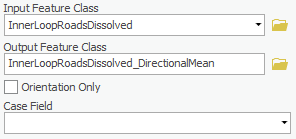
- For the ‘Input Feature Class’, use the drop-down menu , to select the InnerLoopRoadsDissolved layer.
- In For ‘Output Feature Class’, rename it ‘innerLoopRoadsDissolved_DirectionalMean’.
- Leave other fields as default.
- the feature class "InnerLoopRoadsDissolved_DirectionalMean".
- Ensure your Linear Directional Mean tool parameters are configured as shown below and click Run.
Freeways
- In the Contents pane, right-click the InnerLoopRoadsDissolved layer name and select Zoom To Layer.
Notice that the result points in the same direction as the longest roads in downtown Houston. This result indicates that the majority of roads run in a true North-South and East-West direction, which would average out to 45 degrees.
Freeways
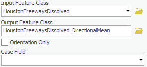
- For In the ‘Input Feature Class’, use the drop-down menu,to select the HoustonFreewaysDissolved layer.
- In For ‘Output Feature Class’, rename it ‘HoustonFreewaysDissolved_DirectionalMean’.
- Leave other fields as default.
- the feature class "HoustonFreewaysDissolved_DirectionalMean".
- Ensure your Linear Directional Mean tool parameters are configured as shown below and click Run.
- In the Contents pane, right-click the HoustonFreewaysDissolved layer name and select Zoom To Layer.
Notice how much longer the linear mean is for the freeways than for all roads. The length is approximately the diameter of Beltway 8, which is the middle of three beltways in Houston. Notice that the direction is also shifted, because the freeways do not run orthogonally, like the local streets.