This guide was created by the staff of the GIS/Data Center at Rice University and is to be used for individual educational purposes only.
The steps outlined in this guide require access to ArcGIS Pro software and data that is available both online and at Fondren Library.
TABLE OF CONTENTS
The following text styles are used throughout the guide:
Explanatory text appears in a regular font.
- Instruction text is numbered.
- Required actions are underlined.
- Objects of the actions are in bold.
Folder and file names are in italics.
Names of Programs, Windows, Panes, Views, or Buttons are Capitalized.
'Names of windows or entry fields are in single quotation marks.'
"Text to be typed appears in double quotation marks."
The following step-by-step instructions and screenshots are based on the Windows 10 operating system with the Windows Classic desktop theme and ArcGIS Pro 3.2.0 software. If your personal system configuration varies, you may experience minor differences from the instructions and screenshots.
Obtaining the Tutorial Data
Before beginning the tutorial, you will copy all of the required tutorial data onto your Desktop. Option 1 is best if you are completing this tutorial in one of our short courses or from the GIS/Data Center and Option 2 is best if you are completing the tutorial from your own computer.
OPTION 1: Accessing tutorial data from Fondren Library using the gistrain profile
If you are completing this tutorial from a public computer in Fondren Library and are logged on using the gistrain profile, follow the instructions below:
- On the Desktop, click the File Explorer icon > This PC > gisdata (\\file-rnas.rice.edu) (R:) > Short_Courses > Map_Layouts_for_Publication
- To create a personal copy of the tutorial data, drag the Layouts folder onto the Desktop.
- Close all windows.
OPTION 2: Accessing tutorial data online using a personal computer
If you are completing this tutorial from a personal computer, you will need to download the tutorial data online by following the instructions below:
Tutorial Data Download
- Click Layouts.zip above to download the tutorial data.
- Open the Downloads folder.
- Right-click Layouts.zip and select Extract All....
- In the 'Extract Compressed (Zipped) Folders' window, accept the default location into the Downloads folder and click Extract.
- Drag the unzipped Layouts folder onto your Desktop.
- Close all windows.
Opening an Existing Project
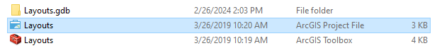
- On the Desktop, double-click the Layouts folder.
- Double-click the Layouts project file to open the project in ArcGIS Pro.
Establishing a Map
Creating the Map
- In the Insert ribbon, under the Project group, click the New Map button.
- In the Catalog pane, expand the Maps folder.
- Right-click on "Map" and select Rename.
- Rename the Map "Median Household Income by Census Block Group."
When creating maps for a purpose in publication, you will likely always create more than one map. Because of this, it is best practice to name each map according to what you are displaying in it. Otherwise, you have Map, Map1, Map2, and so on.
- In the Map ribbon, in the Layer group, click Basemap and select Light Gray Canvas.
- In the Contents pane, uncheck the Light Gray Reference layer to toggle it off.
- In the Catalog pane, in the Databases folder, expand the Layouts.gdb geodatabase.
- Right-click the BlockGroupCensusData feature class and select "Add to Current Map."

Editing Class Boundaries
When creating a map for black-and-white publication, symbology needs to be customized to display the data in a way that is distinct and monochromatic. This requires manual changes to symbology. For instance, when symbology is black and white, choosing a fewer amount of classes aids in differentiating the colors of each class.
- In the Contents pane, right-click BlockGroupCensusData and select Symbology.
- In the new Symbology pane to the right, click the Primary Symbology drop-down menu and select Graduated Colors.
- In the Field drop-down menu, select the MEDIAN_HOUSE_INCOME field.
- In the Classes drop-down menu, select 4.
We will now choose a monochromatic color scheme and use it as a baseline from which to customize it to suit our needs.
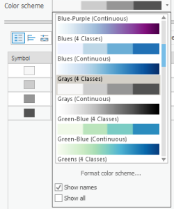
- Click the Color scheme drop-down menu.
- At the bottom of the menu, check "Show names."
- Scroll down the Color scheme menu and select Grays (4 Classes).
Now, we will make sure to manually customize the values in each class before changing the colors so we know exactly how many blocks have these colors before changing the colors. Observe the Upper value column in the Symbology pane. Right now, the Method is set to Natural Breaks (Jenks), which is ArcGIS's default algorithmic way to decide the class split. Unless you have a specific way you want to divide the data, my default recommendation is to use Natural Breaks and round the data to the nearest whole number that makes sense.
- Click on the Upper value cell of the first class that reads "≤ 52768.0"
- When the text becomes editable, type "50000" and press Enter.
The map should refresh to show the upper value of the first class equal to or less than a median household income of $50,000. We will now repeat for the other values.
- Click on the Upper value cell of the second class and type "90000." Press Enter.
- Click on the Upper value cell of the third class and type "150000." Press Enter.
- Leave the Upper value cell for the last class. We cannot change the upper value of the last class as that would exclude data.

View the Label column to the right of the Upper value column. This Label is the text that appears for each class in the Legend created for this layer. We will customize the Label text to translate to a Legend.
The Label text reverts to default every time the Upper value for the cell changes. Therefore, change all the Upper values for your data before customizing the Label.
- Click the Label cell for the first class that reads "≤50000" and type "$0 - $50,000." Press Enter.
- Click the Label cell for the second class that reads "≤90000" and type "$50,001 - $90,000." Press Enter.
- Click the Label cell for the third class that reads "≤150000" and type "$90,001 - $150,000." Press Enter.
- Click the Label cell for the fourth class that reads "≤250001" and type "$150,001 - $250,001." Press Enter.

Editing Class Symbology
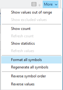
- Click the More drop-down menu to the top right of the Upper value table.
- Click Format all symbols.
- At the top of the pane, note how Gallery is selected by default. Select Properties.
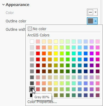
- Click on the color box associated with Outline color.
- Hover over the colors until the labels appear, and select Gray 80%.
- Click on the color box associated with the Outline color again.
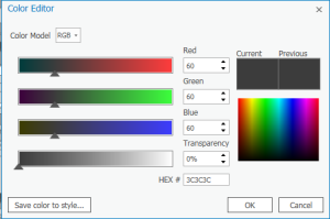
- At the bottom of the pane, select Color Properties...
- In the pop-up Color Editor box, change the Red, Green, and Blue values to 60.
- Make sure the HEX # is 3C3C3C and click OK.
- Change the Outline width to 0.5 pt.
- At the bottom of the pane, click Apply.
In the Contents pane to the left, notice that there is a Legend-like display for the BlockGroupCensusData layer.
- Right-click the color box next to the $0 - $50,000 field. Notice that a color drop-down menu appears.
- Hover over the colors until the label appears, and select Gray 10%.
- Right-click the color box next to the $50,001 - $90,000 field. Select Gray 30%.
- Right-click the color box next to the $90,001 - $150,000 field. Select Gray 50%.
- Right-click the color box next to the $150,001 - $250,001 field. Select Gray 70%.
On the Contents pane to the left, notice that under the BlockGroupCensusData layer name, there is a subtitle of the field symbolized upon that reads MEDIAN_HOUSE_INCOME.
- Click the MEDIAN_HOUSE_INCOME title twice until the text is editable.
Type "Median Household Income by Census Block Group." Hit Enter.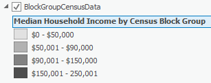
Establishing the Layout
Creating the Layout
- In the Insert ribbon, in the Project Group, click New Layout.
- At the bottom of the drop-down menu, select Custom page size...
- In the General tab on the pop-up Layout Properties box, type "Median Household Income by Census Block Group" in the Name field.
- Click the Page Setup tab to the left. Notice how the default 8.5" x 11" page size is selected.
- Change the Width to 5.
- Change the Height to 4.
- At the bottom of the pop-up, click OK.
A new Layout opens. Notice how a new Layouts folder has appeared in the Catalog pane with this Layout in it.
- On the Insert ribbon, click the Map Frame title with the drop-down arrow.
- Select the frame that contains the "Median H..." name.

- Right-click the 0" mark on the horizontal ruler at the top of the Layout. Select Add Guide.
- At the 5" mark on the horizontal ruler, right-click and select Add Guide.
- Repeat at the 0" and 4" marks on the vertical ruler.
- Select the Map Frame in the center of the Layout. Click and drag the corners to snap to the guides on the corner of the Layout.
- In the Contents pane to the left, expand the Map Frame layer. Expand the original map Median Household Income by Census Block Group layer.
- Right-click on the BlockGroupCensusData layer and select Zoom To Layer.
Now it is time to customize the zoom of the layout.
- In the Layout ribbon, in the Map group, click the Activate button. Notice that now the map itself is editable within the layout.
- Hold down Shift and notice that your mouse changes to a Zoom In magnifying glass.
- Click and drag a box around Harris County with boundaries as close to the edge of the data as possible. Release to zoom in.
- Drag the map up so that there is an inch of space at the bottom of the Layout for a legend to be placed.
- At the top of the Map View, click the back arrow at the left or the red X to the right to exit out of Activation.

Adding Map Surrounds
- In the Insert ribbon, in the Text group, click the drop-down arrow next to Dynamic Text.
- Scroll to the bottom, and within the Layout group, select Service Layer Credits.

This makes the Esri service layer credits for the basemap into a dynamic text box.
- Drag the service layer credits off of the Layout.
- In the Insert ribbon, in the Map Surrounds group, click the North Arrow drop-down menu.
- Select the middle arrow in the first row.
- Click and drag to create the arrow.
- Move the North Arrow to the lower right corner of the map.
- In the Contents pane, click on the North Arrow layer. The Format North Arrow pane pops up on the right.
- Under the North Arrow drop-down menu, select Point Symbol.
- Click the color box associated with the Color field. Select Gray 50%. Click Apply.

- In the Insert ribbon, in the Map Surrounds group, click the Scale Bar drop-down menu.
- Select Alternating Scale Bar 1.
- Click and drag to create the scale bar. Resize the scale bar until you can see the numbers clearly.
- Notice that the Format Scale Bar pane has popped up to the right. Instead of Scale Bar, select Text Symbol to the top.
- Under Size, choose 8 pt. Under the Color box, choose Gray 50%. At the bottom, click Apply.
- Click the Scale Bar drop-down menu. Select Background. Under Outline Color, right-click the associated color box and choose Gray 50%.
- Click the Scale Bar drop-down menu. Repeat changing the colors to Gray 50% for the Symbol 1 and Symbol 2.
- In the Contents pane to the left, click the Map Frame layer.
- In the Format Map Frame pane to the right, click the Map Frame drop-down menu. Select Border.
- Change the Color to No color and select Apply.
Adding a Legend
- In the Insert ribbon, in the Map Surrounds group, click Legend.
- Drag and release a large rectangle around the blank space at the bottom of the map to place the Legend.

- In the Contents pane, click on the Legend layer.
- Under Legend, for Title uncheck Show
- In the Format Legend pane to the right, under the Legend Items section, click the Show properties... button.
- Under the Show list, uncheck Layer name.
- Under Arrangement, change Arrangement to Description | Patch | Label
- If you are still in the Format Legend Item pane, click the top left back arrow in the pane.

The legend cannot show its entire contents because the font is too large. Let's change the fitting strategy so everything fits.
- At the top of the Format Legend pane, select the Legend Arrangement Options tab.
- Under the Fitting Strategy drop-down, select Adjust Font Size.
- Change the Minimum font size until the legend fits all its text.
- Under the Legend drop-down menu, select Headings. Expand Appearance.
- Change the Color to Gray 80% and click Apply.
- Under the Legend drop-down menu, select Labels.
- Change the Color to Gray 80% and click Apply.
Export
- In the Share ribbon, in the Output Group, click the Export Layout button with the green arrow.

- Navigate to your LayoutTutorialData folder on the Desktop.
- Make sure the Save as type is TIFF (*.tif) and the Resolution (DPI) is set to 600.
- Click Export.