This guide was created by the staff of the GIS/Data Center at Rice University and is to be used for individual educational purposes only.
The steps outlined in this guide require access to ArcGIS Pro software and data that is available both online and at Fondren Library.
The following text styles are used throughout the guide:
Explanatory text appears in a regular font.
- Instruction text is numbered.
- Required actions are underlined.
- Objects of the actions are in bold.
Folder and file names are in italics.
Names of Programs, Windows, Panes, Views, or Buttons are Capitalized.
'Names of windows or entry fields are in single quotation marks.'
"Text to be typed appears in double quotation marks."
The following step-by-step instructions and screenshots are based on the Windows 7 operating system with the Windows Classic desktop theme and ArcGIS Pro 2.1.3 software. If your personal system configuration varies, you may experience minor differences from the instructions and screenshots.
Obtaining the Tutorial Data
Before beginning the tutorial, you will copy all of the required tutorial data onto your Desktop. Option 1 is best if you are completing this tutorial in one of our short courses or from the GIS/Data Center and Option 2 is best if you are completing the tutorial from your own computer.
OPTION 1: Accessing tutorial data from a Fondren Library desktop
If you are completing this tutorial from a public computer in Fondren Library and are logged on using the gistrain profile, follow the instructions below:
- Start the File Explorer application and navigate to \\smb.rdf.rice.edu\research\FondrenGDC\GISData\GDCTraining\1_Short_Courses\Analyzing_Spatial_Patterns.
- To create a personal copy of the tutorial data, drag the compressed Patterns folder onto the Desktop.
- Close all windows.
OPTION 2: Accessing tutorial data online using a personal computer
If you are completing this tutorial from a personal computer, you will need to download the tutorial data online by following the instructions below:
Tutorial Data Download
- The tutorial data is too large to host here. Please email gisdata@rice.edu for other options.
- Click Patterns.zip above to download the tutorial data.
- Open the Downloads folder.
- Right-click Patterns.zip and select Extract All....
- In the 'Extract Compressed (Zipped) Folders' window, accept the default location into the Downloads folder and click Extract.
- Drag the unzipped Patterns folder onto your Desktop.
- Close all windows.
Spatial Statistics in ArcGIS Pro
Opening an Existing Project
On the Desktop, double-click the Patterns folder.
Double-click the Patterns.aprx project file to open the project in ArcGIS Pro.
- In the Catalog pane on the right, expand the Databases folder.
- Expand the Patterns.gdb geodatabase.
- Right-click the CensusTracts_MTTW_2014 feature class and select Add To New Map.
This layer provides boundaries for all of the census tracts in Harris County. For more information on census tracts, review the Introduction to Census Geographies course.
- In the Contents pane on the left, right-click the CensusTracts_MTTW_2014 layer name and select Attribute Table.
MTTW stands for Means of Transportation To Work. The attribute table provides data on the percentage of workers 16 and older who commuted by driving alone, carpooling, or taking public transportation.
- Close the CensusTracts_MTTW_2014 table view.
- On the ribbon, click the Analysis tab.
- On the Analysis tab, within the first Geoprocessing group, click the Tools button.

Notice that the Geoprocessing pane has opened on the right as a new tab on top of the Catalog pane. Typically, you would use the 'Find Tools' search box at the top of the Geoprocessing pane to search for the name of the tool you'd like to use, but, at times, especially when learning the software, it can be helpful to view the full hierarchy of all the tools available, because you will often discover related and helpful tools that you didn't know existed and wouldn't know to search for. You might also completely forget the name of a tool, but be able to locate it based on the hierarchy. For these reasons, we will be manually navigating the toolboxes throughout this tutorial. The more typical workflow of searching directly for a specific tool is covered at the end of the Introduction to Geoprocessing tutorial.
Spatial Autocorrelation (Moran's I)
- At the top of the Geoproccessing pane, click the Toolboxes tab.
- Click the Spatial Statistics Tools toolbox > Analyzing Patterns toolset > Spatial Autocorrelation (Global Moran's I) tool.
- In the upper right corner of the ‘Spatial Autocorrelation’ tool, hover over the Help ? button to display the tool help in a pop-up window.
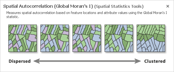
The Spatial Autocorrelation tool evaluates whether data is clustered, dispersed, or randomly distributed, based on both feature locations and feature values simultaneously.
Percent Commuting Alone By Car
- For 'Input Feature Class', use the drop-down menu to select the CensusTracts_MTTW_2014 layer.
- For 'Input Field', use the drop-down menu to select the Percent_CarTruckOrVan_droveAlone field.
- Check Generate Report.
- At the bottom of the Geoprocessing pane, click Run.
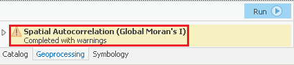
Once the tool has finished running, you will see a message at the bottom of the Geoprocessing pane, indicating that the tool has completed with warnings.
- Hover over the Completed with warnings message to display the tool parameters and messages in a pop-up window.
Under the lower 'Messages' section, notice that the warning message indicates that the neighborhood search distance used in the analysis was 38893 feet. Since the distance threshold does impact the statistical results, it is important to make note of the threshold. You will learn more about the impact of the distance threshold later on. While the Moran's Index I and z-score are also displayed in the messages, they are easier to interpret in the context of the full report.
- Within the 'Spatial Autocorrelation Parameters and Messages' pop-up window, click the Report File hyperlink to open the report in your default web browser. The HTML report file can also be accessed directly from your project folder for future reference outside of ArcGIS Pro.
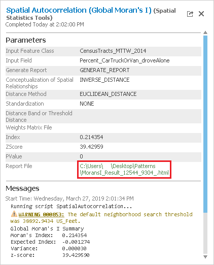
In the top left, notice that the z-score is 39.43. In the top right, notice that any z-score larger than 2.58 has less than 1% chance of occurring randomly. In the center section is the normal distribution curve and a dotted line illustrating where the z-score for this analysis is located on that curve. It also illustrates that a positive z-score indicates that the data is clustered, while a negative z-score would indicate that the data is dispersed. Below the diagram is a helpful summary sentence, "Given the z-score of 39.43, there is a less than 1% likelihood that this clustered pattern could be the result of random chance." Because the z-score is more than an order of magnitude larger than 2.58, you will notice, in the top left, that the p-value is actually 0.00, which means there is essentially no chance that this pattern is random.
Simply knowing that the percentages of people who drove alone to work are highly clustered might not provide you with actionable knowledge, but what this result indicates is that there is a strong spatial pattern present in this data, which is worth investing the time to investigate further. On the other hand, if the data was randomly distributed, you could stop here. Because you know your data displays strong clustering, you can now ask more interesting questions. Is it the high or low percentages of commuters driving alone that are clustered? Where are they clustered? You will find that all of the spatial statistics tools build upon each other to answer these questions and provide additional knowledge.
Percent Commuting By Carpool
As the Geoprocessing pane doesn’t reset after a tool has finished running, it is easy to rerun tools with slightly modified settings. In future versions of ArcGIS Pro, batch processing is also supported, which facilitates multiple runs of the same tool within a single interface.
- In the Geoprocessing pane, for 'Input Field', use the drop-down menu to select the Percent_CarTruckOrVan_carpooled field.
- Click Run.
- Hover over the Completed with warnings message and click the Report File hyperlink.
This time, the z-score is 28.06, which is slightly lower than before, but still indicates that the percent of people who carpool to work is also highly clustered.
Percent Commuting By Public Transportation
- In the Geoprocessing pane, for 'Input Field', use the drop-down menu to select the Percent_PublicTransportation field.
- Click Run.
- Hover over the Completed with warnings message and click the Report File hyperlink.
Again, the z-score indicates that the percent of people who took public transportation to work is highly clustered. The enormous z-score of 55.84 indicates that the public transportation variable is the most highly clustered of the three. Logically, this makes sense, because we would think people living near metro stations or major bus route stops would be more likely to use them and, therefore, people taking public transportation to work would be strongly spatially clustered around those stop locations.
Incremental Spatial Autocorrelation
- At the top of the Geoprocessing pane, click the Back arrow button.
- Within the Analyzing Patterns toolset, click the Incremental Spatial Autocorrelation tool.
- In the upper right corner of the ‘Incremental Spatial Autocorrelation’ tool, hover over the Help ? button.
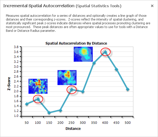
The Incremental Spatial Autocorrelation tool iterates the Spatial Autocorrelation tool using multiple distance bands and plots the corresponding z-scores at each distance. The result is a chart showing you the peak z-scores at distances where spatial clustering is most pronounced.
Percent Commuting Alone By Car
- For 'Input Features', use the drop-down menu to select the CensusTracts_MTTW_2014 layer.
- For 'Input Field', use the drop-down menu to select the Percent_CarTruckOrVan_droveAlone field.
- For 'Number of Distance Bands', type "25".
- For 'Output Report File', type "ISA_DroveAlone_25.pdf". If you click elsewhere, you will be able to see the full file path and notice that the tool will automatically locate your PDF file within your project folder.
- Click Run.
- Hover over the Completed with warnings message and click the Output Report File hyperlink.
Notice that the significance of clustering of the percent of people driving alone to work increases as the distance threshold increases and that there are two peak distances. Also, notice that the data is highly clustered regardless of the distance threshold. On the third page of the PDF, you can see that the peak z-score occurs at a distance of approximately 67,500 feet, or nearly 13 miles.
Percent Commuting By Carpool
- For 'Input Field', use the drop-down menu to select the Percent_CarTruckOrVan_carpooled field.
- For 'Number of Distance Bands', type "10".
- For 'Output Report File', type "ISA_Carpooled_10.pdf".
- Click Run.
- Hover over the Completed with warnings message and click the Output Report File hyperlink.
This variable displays a reverse pattern in that the significance of clustering decreases as distance increases. In fact, when the distance is greater than approximately 65,000 feet, the pattern becomes random, rather than clustered, as indicated by the yellow data points on the chart. This is the same distance at which driving alone displayed peak clustering. You could rerun the tool and specify a beginning distance and a distance increment to determine if there is a peak distance below 40,000 feet.
Percent Commuting By Public Transportation
- For 'Input Field', use the drop-down menu to select the Percent_PublicTransportation field.
- For 'Number of Distance Bands', type "10".
- For 'Output Report File', type "ISA_Transit_10.pdf".
- Click Run.
- Hover over the Completed with warnings message and click the Output Report File hyperlink.
This variable displays a similar curve to the driving alone variable with a similar peak distance around 66,000 feet, but the curve is more pronounced.
High/Low Clustering (Getis_Ord General G)
- At the top of the Geoprocessing pane, click the Back arrow button.
- Within the Analyzing Patterns toolset, click the High/Low Clustering (Getis-Ord General G) tool.
- In the upper right corner of the ‘High/Low Clustering’ tool, hover over the Help ? button.

The High/Low Clustering tool is very similar to Spatial Autocorrelation tool, except instead of telling you whether the data is clustered or dispersed, it tells you whether there are clusters of high values or clusters of low values.
Percent Commuting Alone By Car
- For 'Input Feature Class', use the drop-down menu to select the CensusTracts_MTTW_2014 layer.
- For 'Input Field', use the drop-down menu to select the Percent_CarTruckOrVan_droveAlone field.
- Check Generate Report.
- Click Run.
- Hover over the Completed with warnings message and click the Report File hyperlink.
Notice that the z-score is negative, which indicates that areas in which a low percentage of commuters drive alone are clustered. This probably represents an inverse relationship with commuters who are carpooling or using public transit, in which we expect high percentages to be clustered.
Percent Commuting By Carpool
- For 'Input Field', use the drop-down menu to select the Percent_CarTruckOrVan_carpooled field.
- Click Run.
- Hover over the Completed with warnings message and click the Report File hyperlink.
As expected, this variable displays a high-clusters pattern.
Percent Commuting By Public Transportation
- For 'Input Field', use the drop-down menu to select the Percent_PublicTransportation field.
- Click Run.
- Hover over the Completed with warnings message and click the Report File hyperlink.
This variable also displays a high-clusters pattern, indicating that areas in which a high percentage of commuters use public transportation are clustered.
For the next set of tools, you will run them each twice: once with a polygon dataset of race by census tract and once with a point dataset on crime locations. The instructions for the point dataset are not yet available, but will be posted here on the wiki next week.
Percent White
- At the bottom of the Geoprocessing pane, click the Catalog tab.
- Within the Patterns.gdb geodatabase, right-click the CensusTracts_Race_2014 feature class and select Add To Current New Map.
This layer also provides boundaries for all of the census tracts in Harris County, but, this time, with race data attached.
- In the Contents pane, right-click the CensusTracts_Race_2014 layer name and select Attribute Table.
The attribute table includes data on the percent of the population within each census tract of each race. For this analysis, you will study the distribution of the white population.
- Close the CensusTracts_Race_2014 table view.
Since hot spot analysis is based on a distance threshold, it is important to get a good understanding of the spatial autocorrelation of your data, as it relates to distance threshold. One option, which you will pursue, is to run the Incremental Spatial Autocorrelation tool on the same variable first, to help determine an appropriate distance threshold, which can then be entered in the Hot Spot Analysis tool. Another option is to use the Optimized Hot Spot Analysis tool, which will automatically select an optimal distance threshold for you.
Incremental Spatial Autocorrelation
- At the bottom of the Catalog pane, click the Geoprocessing tab.
- At the top of the Geoprocessing pane, click the Back arrow button.
- Within the Analyzing Patterns toolset, click the Incremental Spatial Autocorrelation tool.
- For 'Input Features', use the drop-down menu to select the CensuTracts_Race_2014 layer.
- For 'Input Field', use the drop-down menu to select the Percent_White field.
- For 'Number of Distance Bands', type "15" .
- For 'Beginning Distance', type "10000" (50000).
- For 'Output Report File', type "ISA_White_15.pdf".
- Click Run.
- Hover over the Completed with warnings message and click the Output Report File hyperlink.
Notice that the the peak threshold distance is 24,962 (54000), which you will use as the distance for your hot spot analysis.
Hot Spot Analysis
- At the top of the Geoprocessing pane, click the Back arrow button.
- Within the Spatial Statistics toolbox, click the Mapping Clusters toolset > Hot Spot Analysis (Getis-Ord GI*) tool.
- In the upper right corner of the ‘Hot Spot Analysis’ tool, hover over the Help ? button.

- For 'Input Features', use the drop-down menu to select the CensusTracts_Race_2014 layer.
- For 'Input Field', use the drop-down menu to select the Percent_White field.
- For 'Output Feature Class', rename the feature class "HSA_White".
- For 'Distance Band or Threshold Distance', type "24962".
- Click Run.
Unlike the previous tools, which only provided a table of statistics, this tool outputs a new spatial layer in your contents pane.
If your newly added HSA_White layer changes from the default blue, white, and red symbology to a single color symbology, hover over the Undo button on the Quick Access toolbar, above the Ribbon.
If the undo step says "Symbology - Update layer renderer : HSA_White, then click the Undo button to restore the default symbology.
Notice that there are hot spots in red, which are statistically significant clusters of high white population, along with cold spots in blue, which are statistically significant clusters of low white population. There are also areas in white, which are not statistically significant. If you are familiar with how race is distributed throughout the city, this result should not be too surprising.
Cluster and Outlier Analysis (Anselin Local Moran's I)
- At the top of the Geoprocessing pane, click the Back arrow button.
- Within the Mapping Clusters toolset, click the Cluster and Outlier Analysis (Anselin Local Moran's I) tool.
- For 'Input Feature Class', use the drop-down menu to select the CensusTracts_Race_2014 layer.
- For 'Input Field', use the drop-down menu to select the Percent_White field.
- For 'Output Features', rename the feature class "COA_White".
- Click Run.
Again, a new layer has been added to your map and you may need to undo the layer render if your census tracts are showing as a single color. The resulting high-high and low-low clusters should fairly closely match the hot and cold spots in the prior analysis and are represented in light pink and blue. The areas of low white population within a cluster of high white population are represented in dark blue and the areas of high white population within a cluster of low white population are represented in dark red. In this case, many of these outliers are on the periphery of the hot and cold spots as they transition into areas which are not significant, which makes the results less interesting. Cluster and outlier analysis is often more telling at a smaller geographic unit. For example, if you were to rerun this same analysis at the census block level, you would see individual red blocks with a high white population within a huge neighborhood of light blue with a low white population. These outliers will prompt you to pose interesting questions to try to explain them. In one neighborhood we investigated in Houston, these high-low outliers, or red blocks, corresponded to blocks with high numbers of building permits. Those two pieces of information combined present a compelling picture of gentrification. Instructions for running the analysis on the block level data will be added to this wiki next week. Because the geographic units are much smaller, calculating the results takes more time.