February 6, 2020 - This tutorial is still being actively edited. Please wait for this message to disappear before completing or printing, if you'd like to view it in its final form.
SimplyAnalytics
Ezproxy
At Rice, SimplyAnalytics is a subscription service that Fondren Library pays for. You can access SimplyAnalytics from the Fondren website or access it directly with this link.
At this point, if you were off campus, you would be prompted to enter your netID and password. For now, choose Sign in as a guest. You will still have access to the features, but you won’t be able to save your work. Creating an account will allow you to save your projects.

Maps
Just like Social Explorer, SimplyAnalytics offers both mapping and tabular features. It automatically directs us to the mapping features. This is a great place to start. For any project, visually exploring your data before you begin processing is best practice. In SimplyAnalytics, you can create shapefiles based on pre-joined data in custom geographies.
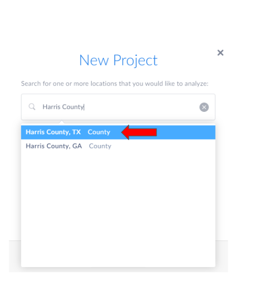
When you first open SimplyAnalytics, it opens a quick tour of the software. You can view it or click out of it. Next, it shows the New Project Wizard pop-up that prompts you to enter your desired location. Start typing the name of the area you are interested in, and select from the drop-down menu (zip code, city, county, states, etc.). You can enter multiple locations, and they will be saved in your recent locations, letting you easily toggle between different locations on the map/creating tables of data. For today, we want to search for Harris County, TX. Make sure you select Harris County, TX from the drop down menu they provide you because there are multiple Harris Counties in the United States. SimplyAnalytics will automatically add three data variables which you can customize (or elect to not have any at all), and your map will display your first location showing Median Household Income.
If you close the New Project Wizard, the map will not be displayed. You will have to manually add your locations and choose data variables.
Navigating SimplyAnalytics
SimplyAnalytics is organized around two sidebars and a top toolbar.
The top toolbar is where you can choose which data variable, location, and geographic unit you want displayed on your map. This is set up in a sentence structure so that it’s easy to understand for users who aren’t familiar with the software. It also has tools to filter what is displayed, adjust Display options, and export your work.

The left sidebar has three tabs – locations, data, and businesses. In Locations, in addition to searching for locations, you can also make custom locations combinations and distance buffers. The right side of the search bar for any tab has a clock icon, and if you have saved favorite locations, a star icon. Clicking these will generate a list of your saved/recent locations to facilitate switching locations.

The Data tab is organized into categories and can also be searched. Upon selecting a category, you can use the left side of the pop-up panel to further filter results. The right side shows all the data options in that category, separated into # and %. Clicking the sandwich button  in each bar can let you ‘show this data variable’ (on map), add to favorites, or view metadata.

The Businesses tab lets you search for all businesses in a location by SIC/NAICS/name, or select SIC/NAICS from categories.

The right sidebar shows your project’s different ‘views.’ The default is the map view, which displays your data variable values by color. The rest show tabular data. The methods of extracting tabular data are purpose-specific, rather than a large batch download.
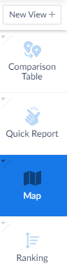
The three other default views are Comparison Table, Quick Report, and Ranking. Comparison Table shows the values of your variables for your project's study area (in this case, Harris County) and the entire United States. Quick Report summarizes your study area based on different categories, such as demographics or housing. Ranking view shows the areas with the top 10, 100, 1000, or 10000 values in your location. For example, the top 100 zip codes in Houston by income.
The other five views are available under the New View button. The Ring Study Table is like a Comparison Table but for the 1, 3, and 5 mile buffers around one specified location. Business Table shows all the businesses in an area according to the specified business category or search. Related Data Tables give data values for your chosen variable AND similar ones it thinks you might be interested in. The Time Series Table makes it easy to see a variable across the entire time span of the data. The Bar Chart lets you create bar charts to compare locations based on a specified variable.
Variables
Before we go on, let’s talk about a few of the categories for which data is available. The first category is demographic data from the US Census Bureau. But the real power of SimplyAnalytics is the availability of data about consumers. Consumer Expenditure provides figures tabulated from the Bureau of Labor Statistics that measure the total expenditures in one year by households in a geographic area for a certain type of product, such as Food and Transportation. On the other hand, Business Counts focus not on the consumer but on the producer side. For each geographic unit, this product provides a count of the number of companies and the number of employees engaging in certain sectors. Market Segments counts the number of people who match a certain profile. We’re lucky at Rice because Fondren subscribes to the additional products NielsenPRIZM and SimmonsLOCAL. Nielsen PRIZM basically provides ridiculously specific market segments. To access NielsenPRIZM, go to the Data tab on the left panel, browse by Data Folder, and click on the PRIZM Premier US folder.

On the left, choose the Segments folder. Now we have a long list of variables to choose from. But I think most people would be a little thrown off by the Variable “Upper Crust.” What does that mean? To find out, we need to access the metadata. Click the right side of the bar to open the menu. The very last option in the menu is View Metadata. The definition provides information about exactly what the variable measures. Today we aren’t going to discuss every category in detail, but you can access metadata for every variable to reach an informed decision to download data.

There is a lot of interesting information, so at this time, take a few minutes to browse the available data individually.
Café Example
I hope you enjoyed your browsing. Now we’re going to come back together to learn about how to choose variables and the locations to actually map them. As I mentioned, the real power of SimplyMap lies within its business data. So let’s imagine that we are a group of restaurateurs looking to open a cool new café in Houston. Before we decide where to open our café, we can use GIS to find the best locations to reach our target demographic. What characteristics do you think our target customers have?
Add to favorites/Select
- Age> # Population, 25 to 34 Years
- Median Household Income
- Consumer behavior > filter – food & beverage, Restaurants > Meals at restaurants, carry outs and other ($000)
- Market segments>Apartments
- Retail > Restaurant Index
Expand the drop down list of data variables in the top bar. The ones you’ve just selected will show up. You can choose any of these to display on your map. To change the level of detail in the map, we can make the geographic unit smaller or larger by opening the drop down list to the right of the Location selector in the top bar. The smallest unit that will be available for any variable on SimplyAnalytics is block groups.
Locations
Make sure the location you chose is a bigger location (CITY, not census tracts or zip codes), unlike other products.
Optional: Create custom location, radius- don’t do during tutorial because the display is a mess
This page is interactive, so you can pan around. You can zoom using either by using your scroll wheel or by clicking on the magnifying glass in the center and then drawing a box around your area of interest. To switch from zooming to panning, just click the icon that looks like a hand.
Business points (SIC cafe)
Look for competition in the Business tab. You can look up an exact sic code or just use a keyword.
Grouped then click.
Map Legend
Next, let’s look at the Map Legend on the right-hand side of the page. Clicking ‘edit’ at the bottom of the legend lets you choose the classification method, number of categories, and color ramps. Also on the Map Legend, we can customize the break points for categories.
Display options
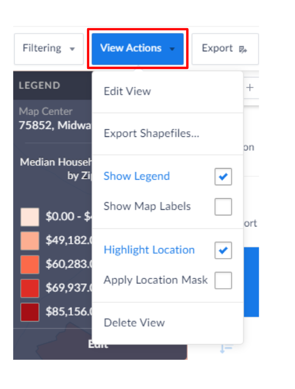
Next turn to the View Actions tab on the toolbar toward the upper-right of the screen to adjust your display options.
Legend
Map Labels
Highlight location
Apply location mask: Clicking this will only show the data of your selected location on the map.
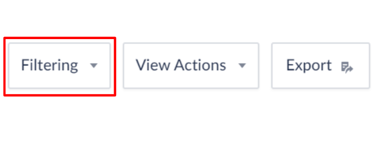
Data Filters
You can create new filter from favorite data variables. For example, make one to only show block groups where the Median Income is greater than $60,000. Click Apply.
Export
Once we are ready to share our work, we can export our map.
Clicking the Export button on the top-right corner allows us to export our map as an image. You can crop down what is displayed on your Map view, adjust Map layout, and choose a file format. You can either choose to save it to your computer, or if you want to share with someone else, email it to them.
One of the coolest features of SimplyAnalytics is the ability to export shapefiles because it saves a lot of processing in Excel and joining in ArcMap. To do this, click the menu between Filtering and Export in the top toolbar and click Export Shapefiles. You can choose what to export from your saved Locations and Data Variables. The only way to download shapefiles is via an email link that should be sent within 5 minutes.

Note that there are download size limits
Note that the shapefile’s attributes will be named value0, value1, value 2, etc. The order of your selected data variables will accord with the order that they are listed in the export screen. For now, disregard the variable_names text file.
Exporting Tables
Clicking the Export button when SimplyAnalytics is on a table view will allow you to save it as excel, csv, or dbf. The menu bar, under columns, allows you to check and uncheck which headings to show.
If you did a business search, you can view a table of all the businesses in a location matching a name/code. To later use this data in ArcMap, export the Business table as a csv/excel and bring it into ArcMap. Right-click the layer and click Display XY data. The Latitude and Longitude values that are provided are noticeably <180 and have negative signs, showing that it’s in a geographic coordinate system. As all the SimplyAnalytics exported data (shapefiles) should be in WGS 1984, they should all spatially align. Although, note that if your analysis includes distance, it is a good idea to project these layers.
Additional Notes
You can also click Categories (Browse Categories) to open a drop-down menu that shows Categories and Folders. Clicking Folders will show data in folders by data source (EASI, FBI, Claritas, Simmons). I think this was the organizational method in SimplyMap, and it allows you to choose very specifically the data type you want (ie. Census US>People and Households>Age>Total># Population, 0 to 5 Years (out of 30 or so options)). Unlike the default categories view, you won’t immediately see all the options in each broader category, which may be helpful if you are only concerned with one data type, know exactly what your source/target data is, or don’t like a cluttered screen.
Last updated 01/30/2020 by Nick Falkenberg