February 6, 2020 - This tutorial is still being actively edited. Please wait for this message to disappear before completing or printing, if you'd like to view it in its final form.
EZproxy
Social Explorer is a subscription service that Fondren Library pays for so that any Rice-affiliate can use it for free. Any time you are on campus, you can go directly to the website (link) and get started right away. However, for any faculty, staff, or off-campus students would like to access Social Explorer at home, you will need to navigate from Fondren’s website to verify that you’re affiliated with Rice. We’ll practice that method of accessing Social Explorer today.
Begin by opening a web browser. In the search bar, type library.rice.edu. This will take you straight to Fondren’s website. Underneath the Search Bar, you will see 4 drop-down options: Catalog, Journals, Databases, and Research Guides. Click the drop-down arrow for Databases and type in Social Explorer. Social Explorer is the first result so go ahead and click it. At this point, if you were off campus, you would be prompted to enter your netID and password.
You can double-check whether you are logged into Rice’s Professional Plan in 2 ways: there should be a pop-up window on the bottom-right hand corner or the top-right hand corner in the teal ribbon should read “Professional plan provided by Rice University”. For now, choose Use as a guest. You will still have access to the features, but you won’t be able to save your work. Creating an account will allow you to save your projects.

Maps
Social Explorer offers data in two forms, as a map and as a table. The mapping features are useful for creating basic maps for quick export or visualization, but for more advanced processing, we use tabular data imported into GIS. However, regardless of your ultimate intentions, you should start with the mapping feature. This gives you an interactive method of exploring your data, seeing preliminary trends, and really seeing if your data is interesting before you begin any cumbersome processing.
Get started by clicking on the Explore Maps tab at the top-left of your screen. Click the first Explore icon so we can look at U.S. Demographics. If it prompts you to take a tour, click skip.

Topics
Data
Let’s begin by exploring the different components that make up the map view. The “Change Data” button on the top left-hand corner is the Data Browser, where you can select the dataset, year, and variable you’re interested in. You can also do a comparison across different years. (ex: population density: 1790, 1860, 2010). The type and availability of variables change over time as the information collected is edited and refined over the years. For example, some of the Censuses from the 1800 provide “slavery” as a variable type which was later eliminated.
There are many more variables to explore, so take a few moments to browse on your own before continuing the guide.
Choose the Census 2010 Hispanic population. Select the year 2010 and choose the “Race” category. The data sources are indicated in bolded letters at the top of each section, so scroll all the way down past ACS estimates to Census 2010 -> Hispanic or Latino Origin By Race -> Hispanic or Latino. When working with Census data, it’s important to know that the Census Bureau considers Hispanic/Latino as an ethnicity rather than a race. On the Census there will be a yes/no question asking whether you are Hispanic/Latino and a separate question where you will identify your race.

Visualization
In the bottom left-hand corner, the color bar and the drop-down arrow is the Map Key which reflects the map display such as the color and cutpoints of the data which are customizable.

The Type of Visualization drop-down is above the Map Key, the default is 'Shaded Area'. There are 3 types – shaded area, bubbles, and dot density. Some variables will not have all three options available because of the nature of the data. For example, if you are looking at median income, you would not be able to use dot density because it is not a count. Another thing to note is that the placement of the dots in dot density are random and don’t necessarily represent specific geographic locations of values.
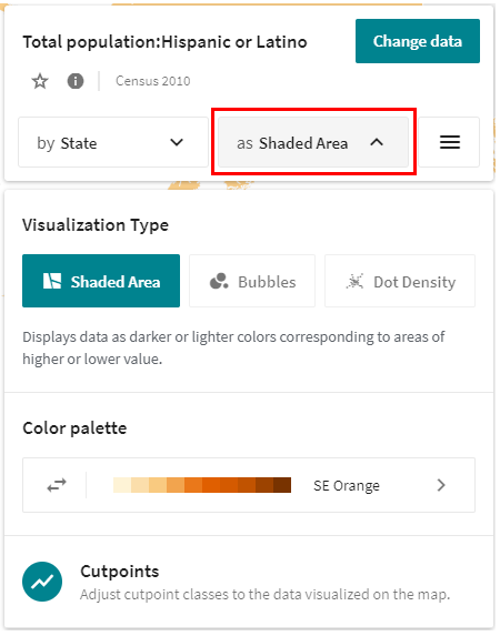
To the left of that, the Geo Selector changes the level of geographic detail displayed on the map. Right now, it is set to State. It selects a level automatically as you zoom in and out of the map. But this default is only a guideline, so you can manually select a different level for more or less detail. To do so, click the drop down menu under Show data by. Next turn off Automatic. Now you can select the geographic level of your choice such as county and tract.

Navigation
Search: You may search for a state, city, county, zip code, or even street address. I am going to search for Houston, Texas. As you type, notice that search results narrow below. Once you see Houston, click on it. The map will automatically zoom to the location you select and outline the boundary in blue.
Zoom, Pan: You can navigate using the zoom tools in the bottom right-hand corner. If you don’t like clicking the buttons, you can also zoom in and out using your scroll wheel. To pan around the map, hold down your left mouse key and drag across the screen.
Map Options
Map Options Menu: The square button to the right of the Type of Visualizations drop down with the three horizontal lines is the Map Options Menu, where you have more customization options such as annotations and turning layers on and off.
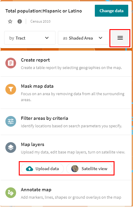
upload my data - if you’re interested in making a simple map and geocode addresses with your variable of interest, upload my data could be a useful feature. You can bring in a CSV file with addresses or lat/long fields to add as a layer to your map. This feature requires an account on the Social Explorer online platform. Remember, if you’re wanting to create a map with multiple variables, it’s much more pragmatic to bring your data into ArcGIS Pro.
satellite view – you see the map as you would in Google Maps. This is intended to help you locate your area of interest.
Storyboard
Storyboard allows you to create multi-map presentations. You can include text, images, charts, videos, and annotations. To use this feature you must create an account. Take a few minutes to sign up because in addition to using storyboard, creating an account also allows you to save your work and return to it later. The account is free for you.
Create Story: For our story, we want to show Hispanic Population Growth in Houston, 1980-2010. You do this by clicking the 'Tell a story' button in the bottom right hand corner, it looks like a play button. Then click 'Start a story'.

To create the story, use the above steps to add one slide as Census 1980 (Persons of Spanish Origin) and another slide as Census 2010 (Hispanic or Latino). It is important that we selected the census county for 2010 rather than the ACS since we are comparing to other censuses. You CANNOT do a comparison-across-time with different data sources.
Export: You will “save as” to save your story to your personal account, this button is in the top right hand corner of your screen. When you are finished, you can export your story as an image or PPTX if you have multiple slides.
Share: You can also share your presentation via a link, email, social media, or embed in website or blog.

Tables
Once you know what data variables you are interested in, you can go to Tables to download data in tabular form for use in GIS or for any statistical processing.
Steps: Click on the Map Options Menu to access the 'Mask map data' option which will allow us to focus on an area of interest. To focus on Harris County, click the 'Geography' dropdown and choose County. Then click on the 'Show sub-geographies' dropdown and turn off all options except Census Tract. Then, on the map, click the shape that is identified as Harris County. Click 'Done' at the top of the screen. 
Now we only see data by census tract in Harris County.
To create a table click the Map Options Menu again and click 'Create report'. Ensure the 'Source' option is "Census 2010" and the 'Topic' option is "Essentials - Demographic Report". To get all of Harris County in the report, click "rectangle selection" and draw a rectangle that covers all of Harris County, now all census tracts are selected and will appear in the report.

To create this report, click 'Create'. You will be brought to a new tab with the results page.The results page provides 3 tabs: Report, Excel, and Data Download.
You can use the Data Dictionary to learn about the methodology of collecting and aggregating this data.
Data download: To bring your data into ArcGIS Pro, you want to download the file as a CSV file. Go to 'Data Download', check on “Output column labels in the first row” so that your variables are labeled with comprehensible labels instead of their numerical code then click the download button to the left of "Census Tract data (CSV)". 
Open the CSV file and use this page to learn about formatting that needs to be done before you can bring the CSV into ArcGIS Pro.