...
For the next set of tools, you will run them each twice: once with a polygon dataset of race by census tract and once with a point dataset on crime locations. The instructions for the point dataset are not yet available, but check back on the wiki next week, as they will be posted.
Percent White
- At the bottom of the Geoprocessing pane, click the Catalog tab.
- Within the Patterns.gdb geodatabase, right-click the CensusTracts_Race_2014 feature class and select Add To Current New Map.
...
Unlike the previous tools, which only only provided a table of statistics, this tool outputs a new spatial layer in your contents pane.
| Info |
|---|
If your newly added HSA_White layer changes from the default blue, white, and red symbology to a single color symbology, hover over the Undo button on the Quick Access toolbar, above the ribbonRibbon.
If the undo step says "Symbology - update Update layer renderer : HSA_White, the click the Undo button to restore the default symbology. |
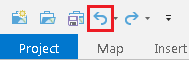
- Above the ribbon, on the Quick Access toolbar, click the Save button.
Cluster and Outlier Analysis (Anselin Local Moran's I)
Notice that there are hot spots in red, which are statistically significant clusters where a high percentage of the population is white, along with cold spots, which are statistically significant clusters were a low percentage of the population is white. There are also areas in white, which are not statistically significant. If you are familiar with how race is distributed throughout the city, this result should not be too surprising.
Cluster and Outlier Analysis (Anselin Local Moran's I)
- At the top of the Geoprocessing At the top of the Geoprocessing pane, click the Back arrow button.
- Within the Mapping Clusters toolset, click the Cluster and Outlier Analysis (Anselin Local Moran's I) tool.
- For 'Input Feature Class', use the drop-down menu to select the CensusTracts_Race_2014 layer.
- For 'Input Field', use the drop-down menu to select the Percent_White field.
- For 'Output Features', rename the feature class "COA_White".
- Click Run.
- Output Features', rename the feature class "COA_White".
- Click Run.
Again, a new layer has been added to your map and you may need to undo the layer render if your census tracts are showing as a single color. The resulting high-high and low-low clusters should fairly closely match the hot and cold spots in the prior analysis and are represented in light pink and blue. The areas of low white population within a cluster of high white population are represented in dark blue and the areas of high white population within a cluster of low white population are represented in dark red. In this case, many of these outliers are on the periphery of the hot and cold spots as they transition into areas which are not significant, which makes the results less interesting. A new layer has been added to your map. Cluster and outlier analysis is often more telling at a smaller geographic unit. It can take longer to process, but if time remains, you may try repeating the cluster and outlier analysis using census blocks.