...
- At the top of the COH_HISTORIC_DISTRICTS table view, click the Clear button.

- Close the attribute table.

Symbolizing Layers By Attributes
...
Selecting Features Programatically
Selecting Features By Attributes
- In the Catalog pane, add the US_tract_2010_harriscounty and US_tract_1980_harriscounty feature class to the Houston History Map view.
- In the Contents pane, right-click the US_tract_2010_harriscounty layer name and select Symbology.
- Use the primary 'Symbology' drop-down menu to select Graduated Colors.
- Use the 'Field' drop-down menu to scroll down sixth from the bottom and select the AV0AA2010 field. This field stores the total number of persons per census tract in the year 2010.
The map view now displays a choropleth map, where the darker colors represent higher counts of people. In studying the map, there does not appear to be a pattern. Now you will try normalizing by the area of the census tract.
- Use the 'Normalization' drop-down menu to scroll to the bottom and select the last Shape_Area field.
As mentioned previously, the projection of the census layer is WGS 1984. Therefore, the layer is unprojected and the coordinates are stored in angular units of decimal degrees. Therefore, the Shape_Area field is displaying square decimal degrees and the map is displaying number of people per square decimal degree. This is a somewhat incomprehesible unit, however, the values are still proportional to how they would be in a different unit and the relative coloring on the map remains correct. If you wanted to make a map that displays vacant housing units per square mile, then you would need to project the US_tract_2010_harriscounty layer. Projecting is further covered in the Introduction to Coordinate Systems and Projections course.
- On the lower half of the Symbology pane, click the Histogram tab.
----------------------------------------------------------------------
Discuss and test classification methods.
----------------------------------------------------------------------
- Use the 'Method" drop-down menu to select Equal Interval.
- Use the 'Method" drop-down menu to select Quantile.
----------------------------------------------------------------------
Discuss and test number of classes.
----------------------------------------------------------------------
- Use the 'Classes' drop-down menu to select 20.
- Use the 'Classes' drop-down menu to select 4.
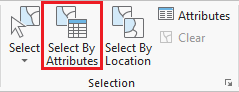
- ribbon, click the Map tab.
- In the Selection group, click the Select By Attributes button to open the Select Layer By Attribute tool in the Geoprocessing pane.
- In the Geoprocessing pane, click the Add Clause button.
- Use the drop-down menus to build the following expression: Name is Equal to 'YOUR_NEIGHBORHOOD_NAME' and click the Add button.
- Ensure your Geoprocessing pane appears similar to that below and click Run.
Exporting Selected Features
- In the Contents pane, right-click the Census_2010_By_SuperNeighborhood layer name and select Data > Export Features.
- In the Geoprocessing pane, click the 'Output Feature Class' field to edit the name. Replace Census_2010_By_SuperNeighbor with "MyNeighborhood". Ensure that you leave everything in the file path through Intro.gdb\.
Selecting Features By Location
Now we will create a map of the bus stops and bus routes within your neighborhood. We could continue to do our mapping within the existing map, but, since we are now focusing on different thematic layers in a different geographic extent, this could be a good time to create a second map within our project.
- On the ribbon, click the Insert tab.
- In the Project group, click the New Map button.
- At the bottom of the Geoprocessing pane, click the Catalog pane tab.
- Rename My Neighborhood and add MyNeighborhoods, BusStops and BusRoutes.
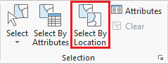
- In the Selection group, click the Select By Location button to open the Select Layer By Attribute tool in the Geoprocessing pane. Select bus stops within neighborhood.
- Select bus routes within 100 ft of bus stop in neighborhood.
Symbolizing Layers By Attributes
Symbolizing Layers By Quantity
- In the Catalog pane, add the US_tract_2010_harriscounty and US_tract_1980_harriscounty feature class to the Houston History Map view.
- In the Contents pane, right-click the US_tract_2010_harriscounty layer name and select Symbology.
- Use the primary 'Symbology' drop-down menu to select Graduated Colors.
- Use the 'Field' drop-down menu to scroll down sixth from the bottom and select the AV0AA2010 field. This field stores the total number of persons per census tract in the year 2010.
The map view now displays a choropleth map, where the darker colors represent higher counts of people. In studying the map, there does not appear to be a pattern. Now you will try normalizing by the area of the census tract.
- Use the 'Normalization' drop-down menu to scroll to the bottom and select the last Shape_Area field.
As mentioned previously, the projection of the census layer is WGS 1984. Therefore, the layer is unprojected and the coordinates are stored in angular units of decimal degrees. Therefore, the Shape_Area field is displaying square decimal degrees and the map is displaying number of people per square decimal degree. This is a somewhat incomprehesible unit, however, the values are still proportional to how they would be in a different unit and the relative coloring on the map remains correct. If you wanted to make a map that displays vacant housing units per square mile, then you would need to project the US_tract_2010_harriscounty layer. Projecting is further covered in the Introduction to Coordinate Systems and Projections course.
- On the lower half of the Symbology pane, click the Histogram tab.
----------------------------------------------------------------------
Discuss and test color schemes.
--------------------------------------------------------
Discuss and test classification methods.
-----------------
Adding Layer Transparency
- Ensure that the US_tract_2019_harriscounty layer is selected.
- In the Appearance tab, in the Effects group, slide the Layer Transparency slider or type "50" and hit Enter on the keyboard.
- Remove layer transparency by typing "0" and hitting Enter on the keyboard.
Swipe Layers
- In the Appearance tab, in the Effects group, slide the Layer Transparency slider or type "50" and hit Enter on the keyboard.
Symbolizing Layers By Category
- Use the primary 'Symbology' drop-down menu to select Unique Values.
- Use the 'Field 1' drop-down menu to select Name.
- In the Contents pane, collapse the Census_2010_By_Superneighborhood symbology.
-----------------------------------------------------
- Use the 'Method" drop-down menu to select Equal Interval.
- Use the 'Method" drop-down menu to select Quantile.
----------------------------------------------------------------------
Discuss and test number of classes.
------------
zoom into neighborhood, go to explore button, click on neighborhood to find out neighborhood name.
------------------------------------------------------------
- Use the 'Classes' drop-down menu to select 20.
- Use the 'Classes' drop-down menu to select 4.
----------
Selecting Features Programatically
Selecting Features By Attributes
...
------------------------------------------------------------
Discuss and test color schemes.
----------------------------------------------------------------------
Adding Layer Transparency
- Ensure that the US_tract_2019_harriscounty layer is selected.
- In the Appearance tab, in the Effects group, slide the Layer Transparency slider or type "50" and hit Enter on the keyboard.
- Remove layer transparency by typing "0" and hitting Enter on the keyboard.
Swipe Layers
- In the Appearance tab, in the Effects group, slide the Layer Transparency slider or type "50" and hit Enter on the keyboard.
Symbolizing Layers By Category
- Use the primary 'Symbology' drop-down menu to select Unique Values.
- Use the 'Field 1' drop-down menu to select Name.
- In the Contents pane, collapse the Census_2010_By_Superneighborhood symbology.
----------------------------------------------------------------------
zoom into neighborhood, go to explore button, click on neighborhood to find out neighborhood name.
----------------------------------------------------------------------
Exporting Selected Features
- In the Contents pane, right-click the Census_2010_By_SuperNeighborhood layer name and select Data > Export Features.
- In the Geoprocessing pane, click the 'Output Feature Class' field to edit the name. Replace Census_2010_By_SuperNeighbor with "MyNeighborhood". Ensure that you leave everything in the file path through Intro.gdb\.
Selecting Features By Location
Now we will create a map of the bus stops and bus routes within your neighborhood. We could continue to do our mapping within the existing map, but, since we are now focusing on different thematic layers in a different geographic extent, this could be a good time to create a second map within our project.
- On the ribbon, click the Insert tab.
- In the Project group, click the New Map button.
- At the bottom of the Geoprocessing pane, click the Catalog pane tab.
- Rename My Neighborhood and add MyNeighborhoods, BusStops and BusRoutes.
...
Presenting and Sharing Maps
...