...
A map is a project item used to display and work with geographic data in two dimensions. The first step to visualizing any data is creating a new map.
The ribbon runs horizontally across the top of the ArcGIS Pro interface. Tools (buttons) are organized into tabs along the ribbon.
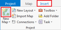
- On the ribbon, click the Insert tab.
- In the Project group, click the New Map button.
...
The panel on the left side of ArcGIS Pro is called the Contents pane. After creating a new map, the Contents pane now displays the default Map Map title and automatically adds the Topographic basemap layer to the map.
...
It is early in the project to be deciding upon symbology, however, when layers are added to a map, ArcGIS Pro assigns then layers a random color symbol. Sometimes the colors are very faint and difficult to see on top of the basemap or the colors of multiple layers are very similar to each other and difficult to distinguish. To ensure that everyone can easily see the layers we are working with, we will adjust the basic symbology.
...
- For 'Symbol', click the colored line symbol to switch to Format Line Symbol mode.

- Within Format Line Symbol mode, click the Properties tab.

- For 'Color', use the drop-down menu to select Cretan Blue. The rivers on the map should now all be blue and easily visible.
- At the bottom of the Symbology pane, click Apply.
The rivers on the map should now all be blue and easily visible. The 'Format Symbol' mode of the Symbology tab can also be accessed directly via the small layer symbol (instead of beneath the layer name ) in the Contents pane.
- In the Contents pane on the left, click the colored rectangle symbol beneath the COH_HISTORIC_DISTRICTS layer name.

- For 'Color', use the drop-down menu to select Mango.

- For 'Outline color', use the drop-down menu to select Gray 50%.
- At the bottom of the Symbology pane, click Apply.
- Repeat either of the above two methods to change the symbology of COH_HISTORIC_SITESLANDMARKS to: 'Color' = Burnt Umber and 'Size' = 5 pt.
- Your three layers should now look like the below image.

- Above the ribbon, on the Quick Access toolbar, click the Save button.
Navigating the Project
Navigating the Contents Pane
...
Within the Spatial Reference section, notice that the geographic coordinate system is GCS WGS 1984 and that no projected coordinate system is listed. Therefore, the layer is unprojected, meaning the data coordinates are located on the three-dimensional surface of the globe and you can see the Angular Unit is listed as Degrees (or decimal degrees.) Therefore, the Shape_Length field is displaying decimal degrees and the Shape_Area field is displaying square decimal degrees, which is why the numbers are so low. Before measuring distance or area, the data layer should be projected onto a two-dimensional surface. The resulting projection will have a Linear Unit, such as feet or meters. The process of projecting is further covered in the Introduction to Coordinate Systems and Projections course.
...
- In the Contents pane, right-click the COH_HISTORIC_DISTRICTS layer name and select Data > Export Features.
- In the Geoprocessing pane, click the 'Output Feature Class' field to edit the name. Replace "COH_HISTORIC_DISTRICTS_CopyF" with "MainStreet_MarketSquare". Ensure that you leave everything in the file path through Intro_Part1.gdb\.
On the the Map tab, in the Selection group, click the Clear button to clear the selected features.
- Select features from COH_HISTORIC_SITESLANDMARKS that intersect MainStreet_MarketSquare. Ensure your Geoprocessing pane appears similar to that below and click Run.

- In the Contents pane, right-click the COH_HISTORIC_SITESLANDMARKS layer name and select Data > Export Features.
- In the Geoprocessing pane, click the 'Output Feature Class' field to edit the name. Replace "COH_HISTORIC_SITESLANDMARKS_" with "Historic_Sites_At_Risk". Ensure that you leave everything in the file path through Intro_Part1.gdb\.
- Click Run.
On the the Map tab, in the Selection group, click the Clear button to clear the selected features.
- Above the ribbon, on the Quick Access toolbar, click the Save button.
Presenting and Sharing Maps
...
- On the ribbon, click the Insert tab.
- In the Project group, click the New Map button.
- At the bottom of the Geoprocessing pane, click the Catalog pane tab.
- Rename the new map "Historic District Flood Risk" and add Historic_Sites_At_Risk, MainStreet_MarketSquare and Major_Rivers to this map.
- Update the symbology for the Historic_Sites_At_Risk, MainStreet_MarketSquare and Major_Rivers layers as desired.
- Above the ribbon, on the Quick Access toolbar, click the Save button.
Creating a Layout
Once you are finished with your analysis, you may want to create a map that is suitable for adding to a report, presentation, or sharing with others who don't have access to ArcGIS software.
- On the ribbon, click the Insert tab.
- In the Project group, click the New Layout button.
- At the bottom of the options panel, select Letter 8.5" x 11" at the top left. A new tab will open in your Map View, called Layout.
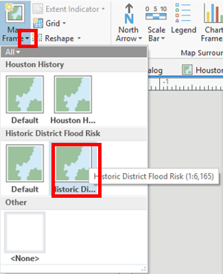
- From the Insert tab, in the Map Frames group, click the drop down arrow on the Map Frame icon and choose the Historic District Flood Risk map frame.
- Above the ribbon, on the Quick Access toolbar, click the Save button.
More tips for creating a layout are covered in the Map Layouts for Publication short course.
...
- On the ribbon, click the Share tab.
- In the Export group, click the Map Layout button with a green arrow.


- On the left, click the Desktop folder.
- Double-click the Intro_Part1 folder.
Discuss export file types and resolutions.
- For 'Resolution (DPI)', type "300".
- Click Export.Click Export.
- Above the ribbon, on the Quick Access toolbar, click the Save button.
- Close ArcGIS Pro.