...
- Click Intro.zip above to download the tutorial data.
- Open the Downloads folder.
- Right-click Intro.zip and select Extract All....
- In the 'Extract Compressed (Zipped) Folders' window, accept the default location into the Downloads folder.
- Uncheck Show extracted files when complete.
- Click Extract.
- Directly within the Downloads folder, drag the Intro folder onto your Desktop.
...
Getting Started with ArcGIS Pro
...
- In the Contents pane, right-click the HGAC_tracts layer name and select Attribute Table.
A table view now appears docked beneath your map view. Each row, or record, in your table corresponds to exactly one census_tract polygon on the map. Each column, or field, in your table represents a variable describing the census tracts.
Every geodatabase feature class has two to four default fields, which cannot be edited or deleted. The leftmost OBJECTID field is a unique ID that is automatically numbered from 1 to the total number of features at the time of creation. The Shape field indicates whether the feature geometry contains points, lines, or polygons. - In the table view, use the scroll bar at the bottom to scroll to the far right of the table.
The other two default fields are the last Shape_Length and Shape_Area fields which contain the perimeter and area of the census tracts, respectively. A line feature class will only contain the Shape_Length field and a point feature class will not contain either field. The units of these fields correspond to the units of the projection in which the data coordinates are stored. - In the Contents pane on the left, double-click the HGAC_tracts layer name.
- In the 'Layer Properties' window, in the left column, click the third Source tab.
- Scroll to the bottom of the window and click to expand the Spatial Reference section.
- Use the scroll bar on the right to scroll through the metadata.
Within the Spatial Reference section, notice that the projected coordinates system is NAD 1983 StatePlane Texas S Central and the linear unit is US Survey Feet. Therefore, the Shape_Length field is displaying feet and the Shape_Area field is displaying square feet. Before measuring distance or area. More information about projections is available in the Introduction to Coordinate Systems and Projections tutorial.
The majority of the remaining fields contain 2010 census data that was aggregated to the census tract level by the Census Bureau. - Scroll back
- Double-click the 'Name' field header to sort the neighborhoods alphabetically.
- To select a neighborhood from the table, click the gray square to the far left of each row.
- To select an adjacent section of records, hold down Shift and select a record below or above the currently selected record to automatically select all records in between.
- While the fields have cryptic names, they are explained in the Field_Names.xls file that came with the original census data download from the H-GAC Regional Data Hub. For this tutorial, we will be interested in field H_1 (Housing Units–All) and H_3 (Housing Units--Vacant).
- Scroll back to the far left of the table.
- Double-click the 'Name10' field header to sort the census tracts numerically.
- Double-click the 'Name10' field header a second time to sort in descending order.
- To select a census tract from the table, click the gray square to the far left of each row.
- To select an adjacent section of records, hold down Shift and select a record below or above the currently selected record to automatically select all records in between.
- To add or remove individual records from the selection, hold down Ctrl and select another record.
Notice in the bottom left corner of the HGAC attribute table, it indicates the number out of 1,109 table records (and corresponding map features) that are currently selected.
The two buttons to the left allow you to toggle between 'Show all records' and 'Show selected records'.
Note that if 'Show selected records' is active and no records are currently selected, the table view will appear empty. If necessary, toggle back to 'Show all records' to view the tableTo add or remove individual records from the selection, hold down Ctrl and select another record.
Notice in the bottom left corner of the Census_2010_By_SuperNeighborhood attribute table, it indicates the number out of 88 table records (and corresponding map features) that are currently selected.
The two buttons to the left allow you to toggle between 'Show all records' and 'Show selected records'.
Note that if 'Show selected records' is active and no records are currently selected, the table view will appear empty. Toggle back to 'Show all records' to view the table. - At the top of the Census_2010_By_SuperNeighbrhood table view HGAC_tracts view, click the Clear button.


- Close the attribute table.


Symbolizing Layers By Attributes
...
- In the Contents pane, right-click the Census_2010_By_SuperNeighborhood HGAC_tracts layer name and select Symbology.
- Use the primary 'Symbology' drop-down menu to select Graduated Colors.

- Use the 'Field' drop-down menu to scroll down sixth from to the bottom and select the SUMH_Vacant field3 field. This field stores the number of vacant housing units within each neighborhoodcensus tract.
The map view now displays a choropleth map, where the darker colors represent higher numbers of vacant housing units. In studying the map, it appears as if the most vacant housing is in southwest Houston outside the Loopscattered throughout the city, but particularly in the southwestern section and the far northern section. While this is true according to raw counts per neighborhoodcensus tract, there could be differences in the neighborhoods census tracts that are unaccounted for in this symbology. Now you will try normalizing by the area of the neighborhoodcensus tract. - Use the 'Normalization' drop-down menu to scroll to the bottom and select the last Shape_Area field.
As discussed in the Introduction to GIS Data Management course, the projection of the census layer is WGS 1984. Therefore, the layer is unprojected and the coordinates are stored in angular units of decimal degrees. Therefore, earlier, the units of the Shape_Area field is displaying square decimal degrees and feet, so the map is displaying number of vacant housing units per square decimal degree. This is a somewhat incomprehensible unit, howeverfoot, which leads to extraordinarily small values. However, the values are still proportional to how they would be in a different unit and the relative coloring on the map remains correct. Notice that, according to the density of vacant housing units, the greatest amount of vacant housing units appear to be both inside and outside the loop along 59is now concentrated primarily inside Beltway 8, though still in Southwest Houston. - Use the 'Normalization' drop-down menu to select the SUM_HU100 field the H_1 field, which contains the total number of housing units within each census tract.
The map is now displaying the number of vacant housing units divided by the total number of housing units, or the percent vacant housing units. While both Notice that, according to percentages, the vacant housing is again spread throughout the map with the a greater concentration in the eastern section inside 610. While all methods of symbolizing the vacant housing units are technically correct, this is probably the most common method. - On the lower half of the Symbology pane, click the Histogram tab.

- Use the 'Method" drop-down menu to select Equal Interval.
Notice how the map changes. Equal Interval divides the range of attribute values into equal-sized subranges. - Use the 'Method" drop-down menu to select Quantile.
Again, the display of data on the map changes. Quantile assigns the same number of data values to each class. - Use the 'Classes' drop-down menu to select 20.
- Use the 'Classes' drop-down menu to select 4.
Observe how changing the number of classes alters the display. - Use the 'Color Scheme' drop-down menu to select a different color scheme of your choice.
Adding Layer Transparency
- Ensure In the Contents pane, ensure that the Census_2010_By_SuperNeighborhood HGAC_tracts layer is selected.
- In the ribbon, click the Feature Layer contextual Appearance tab.
- In the Effects group, slide the Layer Transparency slider or type "50" and hit Enter.
- Return the Layer Transparency slider to "0".
...
- Use the primary 'Symbology' drop-down menu to select Unique Values.Use the
- For 'Field 1' drop-down menu to select Name.
- In the Contents pane, collapse the Census_2010_By_Superneighborhood symbology.
Selecting Features Programatically
Selecting Features By Attributes
...
- , select GEOID10, which contains a unique ID, called a FIPS code, for every census tract.
- When asked 'Do you you want to generate the full list of unique values?', click Yes.
- In the Contents pane, collapse the HGAC_tracts symbology.
Selecting Features Programatically
Sometimes you want to automatically select numerous features in a layer based on certain tabular criteria. In this case, you will select all the census tracts in Harris County out of the larger 13-county region. The COUNTYPF10 field in the attribute table contains the county FIPS code, which is '201' for Harris County.
Selecting Features By Attributes
- In the ribbon, click the Map tab.
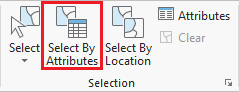
- In the Selection group, click the Select By Attributes button to open the Select Layer By Attribute tool in the Geoprocessing pane.
- In the Geoprocessing pane on the right, ensure 'Input Rows' says HarrisTracts. This layer was selected automatically, because it was selected in the Contents pane at the time you clicked the tool button.
- Click the New selection button.
- Use the drop-down menus to build the following expression: (COUNTYFP10 is equal to '201').
- At the bottom of the Geoprocessing pane, click Run.
Exporting Selected Features
- In the Contents pane, right-click the HGAC_tracts layer name and select Data > Export Features.
- In the Geoprocessing pane, for 'Output Feature Class' type "HarrisTracts". If the full file path is shown, ensure that you leave everything in the file path through Intro.gdb\.
- At the bottom of the Geoprocessing pane, click Run.
- To see the results, in the Contents pane, right-click the newly exported HarrisTracts layer name and select Zoom To Layer.
- In the Contents pane, right-click the original HGAC_tracts layer and select Remove. Note that this process does not delete the layer from your project geodatabase, but only removes the layer from this particular Census Tracts map.
Now you will repeat the above process to select the census tract for Rice University.
- In the 'Selecting Features By Attributes' section above, repeat steps 2-5 for the HarrisTracts layer with the expression: (GEOID10 is equal to 48201412100). You can type in the FIPS code to have it highlighted in the drop-down list rather than scrolling through the entire list to locate it.
You should see the Rice University census tract selected on your map, as shown below. Next you will zoom in closer.
- In the Contents pane, right-click the HarrisTracts layer name and select Selection > Zoom To Selection.

- In the 'Exporting Selected Features' section above, repeat steps 1-3 with the HarrisTracts layer. for 'Output Feature Class' type "Rice".
Selecting Features By Location
Now we will create a map of the bus stops and bus routes that serve the Rice campus. We could continue to do our work within the existing map, but, since we are now focusing on different thematic layers in a different geographic extent, this could be a good time to create a second map within our project.
- On the ribbon, click the Insert tab.
- In the Project group, click the New Map button.
- At the bottom of the Geoprocessing pane, click the Catalog pane tab.
- Rename the new Map1 to "Rice Bus Routes".
- From the Catalog pane, within the Intro.gdb geodatabase, add the METRO_BusRoutes, METRO_BusStops, and Rice feature classes to the new Rice Bus Routes map.
- in the Contents pane, right-click the Rice layer name and selectZoom To Layer.
You will now select all the bus stops within the Rice census tract. To include bus stops across the street from Rice, you will add a search distance of 50 feet from Rice.
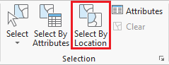
- On the ribbon, in the Selection group, click the Select By Location button to open the Select Layer By Location tool in the Geoprocessing pane.
- For 'Input Features', select METRO_BusStops.
- For 'Relationship', select Within a distance.
- For 'Selection Features', select Rice.
- For 'Search Distance', type '50' Feet.
- Ensure the 'Selection type' is New selection.
- Ensure your 'Select Layer By Location' tool settings appear as shown below and click Run.

Do not clear the selection, as we will use the selected bus stops to now select the bus routes within 100 ft of a bus stop in your neighborhood. - In the 'Select Layer by Location' tool, for the 'Input Feature Layer', select METRO_BusRoutes.
- For 'Relationship', select Within a distance.
- For 'Selecting Features', select METRO_BusStops.
- For 'Search Distance', type "100" Feet.
- Ensure the 'Selection type' is 'New selection'.
- Ensure your 'Select Layer By Location' tool settings appear as shown below and click Run.

All bus stops within 50 feet of Rice, as well as all bus routes that are 100 feet from those stops should now be selected on your map, as shown below.
...
Exporting Selected Features
- In the Contents pane, right-click the Census_2010_By_SuperNeighborhood layer name and select Data > Export Features.
- In the Geoprocessing pane, click the 'Output Feature Class' field to edit the name. Replace Census_2010_By_SuperNeighbor with "MyNeighborhood". Ensure that you leave everything in the file path through Intro.gdb\.
Selecting Features By Location
Now we will create a map of the bus stops and bus routes within your neighborhood. We could continue to do our mapping within the existing map, but, since we are now focusing on different thematic layers in a different geographic extent, this could be a good time to create a second map within our project.
- On the ribbon, click the Insert tab.
- In the Project group, click the New Map button.
- At the bottom of the Geoprocessing pane, click the Catalog pane tab.
- Rename the map My Neighborhood and add MyNeighborhood, BusStops and BusRoutes.
- In the Selection group, click the Select By Location button to open the Select Layer By Location tool in the Geoprocessing pane. Select BusStops for the 'Input Feature Layer'. Select Within a distance for the 'Relationship'. Select MyNeighborhood for the 'Selecting Features'. Type '50' for the 'Search Distance'. Ensure the 'Selection type' is 'New selection'. Ensure your panel looks like the one below and click Run.
- In the Contents pane, right-click the BusStops layer name and select Data > Export Features.
- In the Geoprocessing pane, click the 'Output Feature Class' field to edit the name. Replace BusStops with "MyBusStops". Ensure that you leave everything in the file path through Intro.gdb\.
- In the Contents pane, right-click the BusRoutes layer name and METRO_BusRoutes and select Data > Export Features.
- In the Geoprocessing pane, click the for 'Output Feature Class' field to edit the name. Replace BusRoutes with "MyBusRoutestype "RiceBusRoutes". Ensure that you leave everything in the file path through Intro.gdb\\.
- Click Run.
- In the Contents pane, right-click and remove METRO_BusStops and select Remove.
- Right-click the original METRO_BusRoutes and select Remove.
You should now have three two layers in your Contents pane, UniversityPlace, MyBusStops, and MyBusRoutes. Contents pane: RiceBusRoutes and Rice. - In the Contents pane, right-click RiceBusRoutes and select Zoom To Layer.
The result is a map showing you everywhere you can get by bus from the Rice campus without transferring between routes.

Do not clear the selection. Repeat Step 6, searching for bus routes within 100 ft of a bus stop in your neighborhood. Select BusRoutes for the 'Input Feature Layer'. Select Within a distance for the 'Relationship'. Select BusStops for the 'Selecting Features'. Type '100' for the 'Search Distance'. Ensure the 'Selection type' is 'Add to the current selection'. Ensure your panel looks like the one below and click Run.
Your map should now have selected all bus stops within 50 feet of your neighborhood as well as all bus routes that run within 100ft of those bus stops.
...
Presenting and Sharing Maps
...
Once you are finished with your analysis, you may want to create a map that is suitable for adding to a report, presentation, or sharing with others who don't have access to ArcGIS software.
- On the ribbon, click the Insert tab.
- Click the New Layout button.
- If you wanted to create a custom image size for insertion into a report or presentation, you could select Custom page size at the bottom of the options, but for a full page layout, select Letter 8.5" x 11" at the top left of the options.
analysis, you may want to create a map that is suitable for adding to a report, presentation, or sharing with others who don't have access to ArcGIS software.
- On the ribbon, click the Insert tab.
- Click the New Layout button.
- If you wanted to create a custom image size for insertion into a report or presentation, you could select Custom page size at the bottom of the options, but for a full page layout, select Letter 8.5" x 11" at the top left of the options.
- On the Insert tab, click the Map Frame button with the drop-down arrow.
- Under the 'Rice Bus Routes' map section, select the second frame that is labeled with a scale, such as 1:500:000.
- Click and hold near the top left corner of the layout page and drag the rectangle near the bottom right corner or the layout page.
On the Insert tab, the Map Surrounds group and Text group have buttons which allow you to insert a legend, scale bar, text box, and more. Detailed More tips for creating a layout are covered in the Map Layouts for Publication short course.
...
- On the ribbon, click the Share tab.
- Click the Export Layout button.Layout button.
- For 'File Type', select PDF.
- For 'NameOn the left, click the Browse button and navigate to the Desktop > Intro folder.
- Double-click the Intro folder.
- At the bottom of the 'Export' window, for File name:, type "Rice Bus Routes".
- Click SaveFor 'Resolution (DPI)', type "300".
- Click Export.
- Save and close the project.
- Open the saved PDF in your Intro folder to see the result.
To continue learning intermediate topics in ArcGIS, refer to the courses in the other ArcGIS Pro Series.