...
| Info | ||
|---|---|---|
| ||
|
...
On the Desktop, double-click the the Patterns folderfolder.
Double-click the Patterns.aprx project project file to open the project in ArcGIS Pro.
- In the Catalog pane on the right, expand the Databases folder.
- Expand the Patterns.gdb geodatabase.
- Right-click the CensusTracts_MTTW_2014 feature class and select Add To New Map.
This layer provides boundaries for all of the census tract boundaries tracts in Harris County. For more information on census tracts, review the Introduction to Census Geographies course.
- In the Contents pane on the left, right-click the CensusTracts_MTTW_2014 layer name and select Attribute Table.
MTTW stands for Means of Transportation To Work. The attribute table provides data on the percentage of workers 16 and older who commuted by driving alone, carpooling, or taking public transportation.
- Close the CensusTracts_MTTW_2014 table view.
- On the ribbon, click the Analysis tab.
- On the Analysis tab, within the first Geoprocessing group, click the Tools button.
...
- At the top of the Geoproccessing pane, click the Toolboxes tab.
- Click the Spatial Statistics Tools toolbox > Analyzing Patterns toolset > Spatial Autocorrelation (Global Moran's I) tool.
- In the upper right corner of the ‘Spatial Autocorrelation’ tool, hover over the Help ? button to display the tool help in a pop-up window.
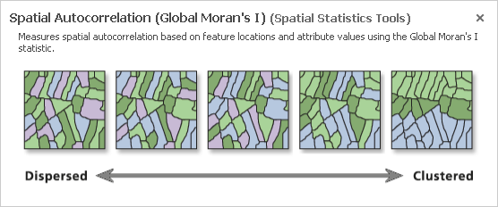
The Spatial Autocorrelation tool evaluates whether data is clustered, dispersed, or randomly distributed based on both feature locations and feature values simultaneously.
...
- For 'Input Feature Class', use the drop-down menu to select the CensusTracts_MTTW_2014 layer.
- For 'Input Field', use the drop-down menu to select the Percent_CarTruckOrVan_droveAlone field.
- Check Generate Report.
- Click At the bottom of the Geoprocessing pane, click Run.
Once the tool has finished running, you will see a message at the bottom of the Geoprocessing pane, indicating that the tool has completed with warnings.
- Hover over the Completed with warnings message to display the tool parameters and messages in a pop-up window.
Under the lower 'Messages' section, notice that the warning message indicates that the neighborhood search distance used in the analysis was 38893 feet. Since the distance threshold does impact the statistical results, it is important to make note of itthe threshold. You will learn more about the impact of the distance threshold later on. While the Moran's Index I and z-score are also displayed in the messages, they are easier to interpret in the context of the full report.
- Within the 'Spatial Autocorrelation Parameters and Messages' pop-up window, click the Report File hyperlink to open the report in your default web browser. The HTML report file can also be accessed directly from your project folder for future reference outside of ArcGIS Pro.
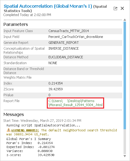
In the top left, notice that the z-score is 39.43. In the top right, notice that any z-score larger than 2.58 has less than 1% chance of occuring occurring randomly. In the center section is the normal distribution curve and a dotted line illustrating where the z-score for this analysis is located on that curve. It also illustrates that a positive z-score indicates that the data is clustered, while a negative z-score would indicate that the data is dispersed. Below the diagram is a helpful summary sentence, "Give Given the z-score of 39.43, there is a less than 1% likelihood that this clustered pattern could be the result of random chance." Because the z-score is more than an order of magnitude larger than 2.58, you will notice in the top left that the p-value is actually 0.00, which means there is essentially no chance that this pattern is random. While simply
Simply knowing that the percentages of people who drove alone to work are highly clustered might not provide you with actionable knowledge, but what this result does indicate indicates is that there is a strong spatial pattern present, which is worth investigating investing the time to investigate further. If the data was randomly distributed, you could stop here. Because you know your data displays strong clustering, you can now ask more interesting questions. Is it the high or low percentages of commuters driving alone that are clustered? Where are they clustered? You will see find that all of the spatial statistics tools build upon each other to answer these questions and provide additional knowledge.
...
Again, the z-score indicates that the percent of people who took public transportation to work is highly clustered. The enormous z-score of 55.84 indicates that the public transportation variable is the most highly clustered of the three. Logically, this makes sense, because we would think people living near metro stations or major bus routes route stops would be more likely to use them and, therefore, people taking public transportation to work would be spatially clustered around those stop locations.
...
- At the top of the Geoprocessing pane, click the Back arrow button.
- Within the Analyzing Patterns toolset, click the Incremental Spatial Autocorrelation tool.
- In the upper right corner of the ‘Incremental Spatial Autocorrelation’ tool, hover over the Help ? button.
- (Help)
The Incremental Spatial Autocorrelation tool iterates the Spatial Autocorrelation tool is going to repeatusing multiple distance bands and plots the corresponding z-scores at each distance. The result is a chart showing you the peak z-scores at distances where spatial clustering is most pronounced.
Percent Commuting Alone By Car
- For 'Input Feature ClassFeatures', use the drop-down menu to select the CensusTracts_MTTW_2014 layer.
- For 'Input Field', use the drop-down menu to select the Percent_CarTruckOrVan_droveAlone field.
- For 'Number of Distance Bands', type25.
- For 'Output Report File', type "ISA_DroveAlone_25.pdf". If you click elsewhere, you will be able to see the full file path and notice that it the tool will automatically locate your PDF file within your project folder.
- Click Run.
Percent Commuting By Carpool
...
- Hover over the Completed with warnings message and click the Output Report File hyperlink.
Notice that the significance of clustering of the percent of people driving alone to work increases as the distance threshold increases and that there are two peak distances. Also, notice that the data is highly clustered regardless of the distance threshold. On the third page of the PDF, you can see that the peak z-score occurs at a distance of approximately 67,500 feet, or nearly 13 miles.
Percent Commuting By Carpool
- For 'Input Field', use the drop-down menu to select the Percent_CarTruckOrVan_carpooled field.
- For 'Number of Distance Bands', type 10.
- For 'Output Report File', type "ISA_Carpooled_10.pdf".
- Click Run.
- Hover over the Completed with warnings message and click the Output Report File hyperlink.
This variable displays a reverse pattern in that the significance of clustering decreases as distance increases. In fact, when the distance is greater than approximately 65,000 feet, the pattern becomes random, rather than clustered, as indicated by the yellow data points on the chart. This is the same distance at which driving alone displayed peak clustering. You could rerun the tool and set a beginning distance and distance increment to determine if there is a peak distance below 40,000 feet
...
.
Percent Commuting By Public Transportation
- For 'Input Field', use the drop-down menu to select the Percent_PublicTransportation field.
- For 'Number of Distance Bands', type15 10.
- For 'Output Report File', type "ISA_Transit_1510.pdf".
- Click Run.
- Hover over the Completed with warnings message and click the Output Report File hyperlink.
This variable displays a similar curve to the driving alone variable with a similar peak distance around 66,000 feet, but the curve is more pronounced.
High/Low Clustering (Getis_Ord General G)
...
- At the top of the Geoprocessing pane, click the Back arrow button.
- Within the Spatial Statistics toolbox, click the Mapping Clusters toolset > Optimized Hot Spot Analysis tool.
- In the upper right corner of the ‘Hot Spot Analysis’ tool, hover over the Help ? button.
- (Help)
asdf
- For 'Input Features', use the drop-down menu to select the CensusTracts_Race_2014 layer.
- For 'Output Features', type "Race_OHSA".
- For 'Analysis Field', use the drop-down menu to select the Percent_White field.
- Check Check Generate Report.
- Click Run.
Cluster and Outlier Analysis (Anselin Local Morans I)
...
A good rule of thumb for the XY tolerance is to consider the accuracy of your data. In this case, all crimes were reported by blocks and were geocoded at centers of blocks, so we could techically will set XY tolerance to 0 for the aggregation.
Collect Events
- In the Geoprocessing pane, within the Spatial Statistics Tools toolbox,click the Utilities toolset > Collect Events tool.
- Click OK.
...