This guide was created by the staff of the GIS/Data Center at Rice University and is to be used for individual educational purposes only.
The steps outlined in this guide require access to ArcGIS Pro software and data that is available both online and at Fondren Library.
The following text styles are used throughout the guide:
Explanatory text appears in a regular font.
- Instruction text is numbered.
- Required actions are underlined.
- Objects of the actions are in bold.
Folder and file names are in italics.
Names of Programs, Windows, Panes, Views, or Buttons are Capitalized.
'Names of windows or entry fields are in single quotation marks.'
"Text to be typed appears in double quotation marks."
The following step-by-step instructions and screenshots are based on the Windows 7 operating system with the Windows Classic desktop theme and ArcGIS Pro 2.1.3 software. If your personal system configuration varies, you may experience minor differences from the instructions and screenshots.
Obtaining the Tutorial Data
Before beginning the tutorial, you will copy all of the required tutorial data onto your Desktop. Option 1 is best if you are completing this tutorial in one of our short courses or from the GIS/Data Center and Option 2 is best if you are completing the tutorial from your own computer.
OPTION 1: Accessing tutorial data from Fondren Library using the gistrain profile
If you are completing this tutorial from a public computer in Fondren Library and are logged on using the gistrain profile, follow the instructions below:
- On the Desktop, double-click the Computer icon > gisdata (\\file-rnas.rice.edu) (R:) > Short_Courses > Data_Interpolation_and_Extraction.
- To create a personal copy of the tutorial data, drag the Interpolation folder onto the Desktop.
- Close all windows.
OPTION 2: Accessing tutorial data online using a personal computer
If you are completing this tutorial from a personal computer, you will need to download the tutorial data online by following the instructions below:
Tutorial Data Download
- Click Interpolation.zip above to download the tutorial data.
- Open the Downloads folder.
- Right-click Interpolation.zip and select Extract All....
- In the 'Extract Compressed (Zipped) Folders' window, accept the default location into the Downloads folder and click Extract.
- Drag the unzipped Interpolation folder onto your Desktop.
- Close all windows.
Opening an Existing Project
- On the Desktop, double-click the Interpolation folder.
- Double-click the Interpolation.aprx project file to open the project in ArcGIS Pro.
Scenario Description
Imagine that you work for an insurance agency and a hurricane has just hit Houston. You have gathered data on rain and wind from the National Oceanic and Atmospheric Agency (NOAA) in the form of rain gauge estimates of rainfall and a feature class depicting the peak average wind speeds when the hurricane landed. Your company has several policy holders claiming that damage was done to their homes during the course of the hurricane. Investigators have gone out to the houses to document the damage, but the company needs to know what the hurricane conditions were like at each house before awarding any claim money. However, none of the houses in question lie directly at a rain gauge or a hurricane wind speed line, so you must interpolate the data with the most accurate interpolation technique and extract the data so that it is in a convenient tabular format for your supervisor.
Preparing Data
Preparing Vector Data
- In the Catalog pane on the right, expand the Folders folder.
- Expand the Interpolation folder.
- Expand the Interpolation.gdb geodatabase.
- Right-click the Texas feature class and select Add To New Map.
The state of Texas appears in your new Map view.
- In the Catalog pane, right-click the Hurricane feature class and select Add To Current Map.
The rings represent the particular wind speed readings for the hurricane.
- In the Contents pane, right-click the Hurricane layer name and select Attribute Table.
Notice that there is a Windspeed attribute that tells you the peak average wind speed along each ring when the hurricane landed. The wind speeds varied from 95 to 120 miles per hour.
- Close the Hurricane table view.
Preparing Tabular Data
- In the Catalog pane, double-click the Houses.xls Excel file to view its individual worksheets.
Remember that ArcGIS Pro can only add one worksheet within an Excel file at a time, so you will need to specify which worksheet you wish to add. In most cases, you will be interested in the first worksheet.
- Under the Houses.xls Excel file, right-click the Sheet1$ worksheet and select Add To Current Map.
Notice that a new section called ‘Standalone Tables’ has appeared at the bottom of the Contents pane, because the tabular data you just added does not have a spatial component, so it cannot yet be drawn and will not appear in the map view.
- In the Catalog pane, double-click the Rainfall.xls Excel file to expand it and view its individual worksheets.
- Under the Rainfall Excel file, right-click the Sheet1$ worksheet and select Add To Current Map.
Because both of the individual Excel worksheets were not renamed, they are both listed as Sheet1$ in the Table of Contents.
- At the top of the Contents pane, click the List By Data Source button.
- If you cannot see the entire file paths, hover over the right edge of the Contents pane until your cursor turns into a double-sided arrow.
- Click and drag the right edge of the Contents pane to the right until you can see the full file paths.
Now you can see the name of the Excel file from which each Sheet1$ originated, but to avoid further confusion, you will rename the Excel worksheet layers. This action will not rename the worksheets in the actual Excel file, but only how they are listed in the Contents pane in this particular Map.
- Underneath the Houses.xls file path, click the Sheet1$ table to select it.
- Click directly on the Sheet1$ table name again to enable renaming and type “Houses”.
- Underneath the Rainfall.xls file path, click the Sheet1$ table to select it.
- Click directly on the Sheet1$ table name again to enable renaming and type “Rainfall”.
Now you will examine what data is contained in each of the two tables.
- Right-click the Houses table and select Open.
Note that the Houses table includes the longitude and latitude of each house that has filed an insurance claim.
- Close the Houses table view.
- Right-click the Rainfall table and select Open.
Note that the Rainfall table includes the longitude and latitude of each rain gauge in the hurricane area, as well as the inches of rainfall collected in each gauge during the hurricane.
- Close the Rainfall table view.
Mapping XY Data
Both the Houses and Rainfall tables include coordinates for the longitude and latitude of each data point; however, in order to display this tabular data in a graphic format, you will need to map these points based on their XY coordinates.
- In the Contents pane, right-click the Rainfall table and select Display XY Data.
Notice that the Geoprocessing pane has opened on the right as a new tab overlaying the Catalog pane. In the 'Make XY Event Layer' tool, notice that 'XY Table' is already set to the Rainfall table, since that was the table used to open the tool.
- For ‘X Field:’ use the drop-down menu to select the Longitude field.
- For ‘Y Field:’ use the drop-down menu to select the Latitude field.
- Ensure your window matches that below and click Run.

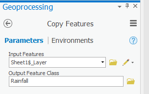
Your map now shows the location of each rain gauge as a point feature, but the functionality of your data will be limited until you export the data to a new layer. The locations of the points in the Rainfall table are currently stored in a temporary layer called Sheet1$_Layer. Since the points appear to be in reasonable locations, you will want to export the temporary layer into a new permanent feature class within your project geodatabase. Exporting to a feature class will allow you to manipulate these points and reuse them in other future maps without having to go through the display XY data process each time.
- In the Contents pane, right-click the Sheet1$_Layer layer and select Data > Export Features.
- For ‘Output Feature Class:’, rename the feature class from “Sheet1_Features_CopyFeatures” to “Rainfall”.
- Ensure your ‘Copy Features’ window appears as shown below and click Run.
Since you have now created a permanent feature class, you may remove your temporary events layer and the corresponding Excel table.
- In the Contents pane, right-click the Sheet1$_Layer layer and select Remove.
- In the Contents pane, right-click the Rainfall table and select Remove.
Now you will repeat the same process to create a permanent point feature class for the Houses data table.
- Repeat steps 1 - 9 using the Houses table. Rename the exported feature class “Houses” and then remove the Houses table from the Table of Contents.
Your Map Display now shows the locations of all of the houses filing insurance claims due to the hurricane and you have all the necessary layers added into your map document.
- At the top of the Contents pane, click the List by Drawing Order icon.
- Click and drag the right edge of the Contents pane back to the left, so that it is only wide enough to display the short layer names.
Interpolating Data
Interpolation allows you to estimate the values of new data points based on the values of existing data points. In this case, you would like to estimate the rainfall values at each of the house locations based on the rainfall values recorded at each of the rain gauge locations. The following section will teach you several methods of interpolating both point and line vector data into raster datasets, which provide estimated values of the data variables across the entire region. You will see how these different interpolation techniques lead to varying resulting raster datasets. It is important to select an interpolation technique best suited to your existing data and your desired analysis.
Point Interpolation
First you will interpolate the rainfall data, because point data is usually easier to interpolate to raster data than line or polygon data. In this section, you will interpolate the rainfall data using the Inverse Distance Weighted, Spline, Natural Neighbors, and TIN interpolation methods.
Since you are only interpolating the rainfall data at this point, you will temporarily turn off some of the other layers.
- In the Contents pane, uncheck the Houses and Hurricane layers so that they are no longer visible.
At this point, only the Rainfall and Texas layers should be visible.
Inverse Distance Weighted Interpolation Method
- In the Geoprocessing pane, click the Toolboxes tab.
- Double-click the Spatial Analyst Tools toolbox > Interpolation toolset.
- Click the IDW (Inverse Distance Weighted) tool.
- In the ‘IDW’ window, use the ‘Input point features’ drop-down box to select the Rainfall layer, which contains your rain gauge data points.
- Use the ‘Z value field’ drop-down box to select the Rainfall field that contains the values you wish to interpolate.
- For ‘Output raster’, rename the exported raster from “Idw_Rainfall1” to “IDW_Rain”.
- Leave the other fields with their default settings, ensure your ‘IDW’ window appears as shown below, and click Run.
It will take several seconds for the tool to begin running, at which point you will see the name of the tool across the bottom portion of the Geoprocessing pane. When the tool has finished running, a box will pop up in the same corner with the name of the tool and a green checkmark.
Currently, you cannot see most of the newly interpolated raster layer, because it is beneath the Texas layer.
- Drag the IDW_Rain layer to the top of the Contents pane, above the Houses layer, so that it is fully visible.
Now you cannot see the interpolation points, because they are beneath the new raster layer. To make them visible, you will make the raster layer transparent.
- In the Contents pane, click the IDW_Rain layer.
- Click the Display tab.
- Under Feature Layer, on the Appearance tab, in the Effects group, adjust the Layer Transparency slider to 40%.
Notice that you can now see the other layers beneath the raster layer in the Map Display window.
The raster layer is currently symbolized using nine classes; however, the values of the cells in the raster are actually more continuous in nature, so you will symbolize them continuously, rather than in classes.
- Right-click the IDW_Rain layer and click Symbology.
- At the top, beneath ‘Symbology,’ select Stretch.
- Use the ‘Color scheme’ drop-down box to select a blue color ramp.
You can now see the continuously interpolated raster containing rainfall values that were generated using the data collected at the specific rain gauge points. Notice how this IDW method results in distinct rings around each input data point.
- In the Contents pane, uncheck the IDW_Rain layer.
- In the Geoprocessing pane, click the Toolboxes tab.
- In the Interpolation toolset, double-click the Spline tool.
- Repeat steps 5-16 above in the Inverse Distance Weighted Interpolation Method section on pages 12 and 13, but rename the raster output “Spline_Rain”.
Spline Interpolation Method
Compare the result of the Spline interpolation to the result of the IDW interpolation by turning each layer on and off in the Table of Contents. Since the layers are transparent, you need to ensure that only one raster is turned on at a time. Notice how the Spline interpolation tries to reduce the sharp edges and sudden jumps in data and does not exhibit the distinct rings around the input points, as the IDW method does. The Spline interpolation process assumes that, overall, there is a smooth transition in the data and tries to mirror that effect in its output.
- In the Contents pane, uncheck the Spline_Rain layer and any other raster layers you turned on.
- In the Geoprocessing pane, click the Toolboxes tab.
- In the Interpolation toolset, double-click the Natural Neighbor tool.
- Repeat steps 5-16 above in the Inverse Distance Weighted Interpolation Method section on pages 12 and 13, but rename the raster output “NN_Rain”.
Natural Neighbors Interpolation Method
Compare the result of the Natural Neighbors interpolation to the results of the previous two interpolation methods. Note that it is smooth everywhere except for the distinct highs and lows directly around the data points, though even at the data points it is smoother than in the IDW interpolation method. Note also that the interpolation is limited to the area covered by the input points, rather than a rectangle of the same extent.
- In the Contents pane, uncheck the NN_Rain layer and any other raster layers you turned on.
TIN Interpolation Method
Using the Create TIN tool, you can create a TIN based on an existing feature class.
- In the Geoprocessing pane, click the Toolboxes tab.
- Double-click the Spatial Analyst Tools toolbox to collapse it.
- Double-click 3D Analyst Tools > Data Management > TIN > Create TIN.
- For ‘Output TIN’, type “TIN_Rain” and click elsewhere to update the text field.
- Use the ‘Coordinate System’ drop-down box to select the Rainfall feature class.
- Use the ‘Input Features’ drop-down box to select the Rainfall feature class.
- Use the ‘Height Field’ drop-down box to select the Rainfall field.
- Ensure your ‘Create TIN’ window appears as shown below and click Run.
This method interpolates the rainfall data points by defining the vertices of each triangle in the TIN and interpolating across each triangle. From here, it is very simple to convert the TIN to a raster, so that it is in the same format as your other interpolation layers.
- In the Geoprocessing pane, click the Data Management toolset to collapse it.
- In the 3D Analyst Tools toolbox, click Conversion > From TIN > TIN to Raster.
- Use the ‘Input TIN’ drop-down box to select the TIN_Rain TIN.
- For ‘Output raster’, rename the exported raster from “TIN_Rain_Tin” to “TINRast_Rain”.
- Ensure your ‘TIN to Raster’ window appears as shown below and click Run.
- In the Contents pane, uncheck the TIN_Rain layer to view the new raster layer created from the TIN.
- Repeat steps 11-16 above in the Inverse Distance Weighted Interpolation Method section on page 12 to symbolize the TINRast_Rain layer as you did the other raster layers.
Compare the results of the TIN interpolation to the results of the previous three interpolation methods. Note that the triangulation method results in defined and continuous ridges and valleys, which makes sense, because TIN files are most commonly used to represent land elevation.
Now you have explored four methods for interpolating the rainfall data, so you will turn off the layers you have generated in this Point Interpolation section.
- In the Contents pane, uncheck all layers, except for the Texas layer.
Line Interpolation
You will now try interpolating the Hurricane line feature class using the same TIN-based method you just used to interpolate the rainfall point data. Recall that the Hurricane feature class contains a Windspeed field in its attribute table, which tells you the peak average wind speed along each line at the time the hurricane landed.
- In the Contents pane, check the Hurricane layer to make it visible.
- In the Analysis Tab, click the Tools button.
- In the Geoprocessing pane, click the Toolboxes tab.
- In ArcToolbox navigate to 3D Analyst Tools > Data Management > TIN > Create TIN.
- For ‘Output TIN’, type “TIN_Wind” and click elsewhere to update the text field.
- Use the ‘Input Feature’ drop-down box to select the Hurricane feature class.
- Use the ‘Height Field’ drop-down box to select the Windspeed field as shown below.
- Use the ‘Coordinate System’ drop-down box to select the Houses layer.
- Ensure your ‘Create TIN’ window appears as shown below and click Run.
Again, you need to convert the TIN to a raster, so that it is comparable to the other interpolation layers.
- Repeat steps 9-16 above in the TIN Interpolation Method section on pages 15 and 16, but select TIN_Wind for the input TIN and name the output raster “TINRast_Wind”.
- In the Contents pane, click the arrow next to all of the raster and TIN layers to collapse their symbologies.
Extracting Data
All of the raster interpolations you have created for wind and rain provide continuous value estimates over the entire hurricane area, but you are only interested in the data values at the particular locations of the individual houses filing insurance claims. You will extract point data for each of the house locations from each of the five raster layers you just created in a database-compatible format for the insurance company to use. Extracting data is one of the most important aspects of data manipulation, since interpolation is useless if the results cannot be taken out of GIS and used for other procedures.
Extracting Multi Values to Points
- In the Analysis Tab, click the Tools button.
- In the Toolboxes tab, click the 3D Analyst Tools toolbox to collapse it.
Before extracting data, you must define the projections of the TIN raster layers.
- Click Data Management Tools > Projections and Transformations > Define Projection
- In the ‘Input Dataset or Feature Class’ drop-down box, click TINRast_Rain.
- For ‘Coordinate System’, click the icon to the right of the box, shown below.
- Double-click Geographic Coordinate Systems to expand it. Scroll down to World, and double-click World. Select WGS 1984. Click OK.
- Ensure that the ‘Define Projection’ window appears as shown below and click OK.
- Repeat steps 3-7 for TINRast_Wind, except for the ‘Input Dataset or Feature Class’ drop-down select TINRast_Wind.
- Click Spatial Analyst Tools > Extraction > Extract Multi Values to Points.
- Use the ‘Input point features’ drop-down box to select the Houses layer.
- Use the ‘Input rasters’ drop-down box to select all five interpolation rasters you created earlier one at a time: IDW_Rain, Spline_Rain, NN_Rain, TINRast_Rain and TINRast_Wind. The order in which the rasters are listed is the same order in which the extracted value columns will appear in the output feature class attribute table.
- Check Bilinear interpolation of values at point locations.
- Ensure your ‘Extract Multi Values to Points’ window appears as shown below and click Run.
The Extract Multi Values to Points tool simply adds a field for the value of each raster to the end of your existing Houses attribute table, which is why you were not asked for an output location.
- In the Contents pane, right-click the Houses layer and select Attribute Table.
Notice the five new fields added to the end of the existing attribute table which contain the values of each of the five rasters at each house location. Notice also the differences in rainfall estimates resulting from the four different interpolation techniques. At many house locations, the value of the Spline interpolation is the most different from the other interpolation method values.
You are now ready to export the data table into a format that can be used by the insurance company without having to use ArcGIS software.
- Click Conversion Tools > Excel > Table To Excel.
- Use the ‘Input Table’ drop-down box to select Houses.
The output table location defaults to your project folder.
- For ‘Output Excel File’, replace “Houses_TableToExcel” with “Houses_Rain_Wind”.
- Check Use field alias as column header.
- Ensure your ‘Table To Excel’ pane looks like that shown below and click Run.
Now you have what the insurance company is looking for: a single text file containing the locations of the houses in question, as well as the corresponding rainfall and wind speed estimates to use in completing a damage quote for your customers.
- Close the Houses table view.
Note that if you simply wanted a table containing the values of multiple rasters at each point and did not care about symbolizing or working with the points any further in the ArcGIS Pro environment, you could have used the Sample tool which outputs a separate table, rather than adding the values to the end of your existing feature class attribute table.
Raster Calculations
Your final project involves working with the raster calculator. The raster calculator performs calculations on a cell-by-cell basis and outputs the calculation results in a new output raster. You will perform a simple calculation using the raster calculator, but the raster calculator can perform many functions, such as adding or subtracting one raster from another, multiplying a raster by a constant, or removing a predetermined “null” value.
For this example, you have learned that the rainfall data collected from the rain gauges had a common discrepancy. Each gauge misrepresented the rainfall amount by two inches uniformly across the state. There are several ways you could approach this problem, but you will add two inches uniformly across the interpolated rain raster to practice using the raster calculator.
- In the Geoprocessing pane, in the Spatial Analyst Tools toolbox, click Map Algebra > Raster Calculator.
- Under ’Rasters’, double-click the IDW_Rain layer.
- Under ‘Operators’, click the + operator.
- For ‘Output raster’, rename the exported raster from “idw_rain_ras” to “IDW_Rain_2”.
- Ensure your ‘Raster Calculator’ window looks like that shown below and click Run.
You have now learned multiple methods of interpolating point and line data into raster data and extracting raster data at point locations. You have also reviewed skills from other short courses, including mapping XY data.