TABLE OF CONTENTS
This guide was created by the staff of the GIS/Data Center at Rice University and is to be used for individual educational purposes only. The steps outlined in this guide require access to ArcGIS Pro software and data that is available both online and at Fondren Library.
The following text styles are used throughout the guide:
Explanatory text appears in a regular font.
- Instruction text is numbered.
- Required actions are underlined.
- Objects of the actions are in bold.
Folder and file names are in italics.
Names of Programs, Windows, Panes, Views, or Buttons are Capitalized.
'Names of windows or entry fields are in single quotation marks.'
"Text to be typed appears in double quotation marks."
This course will teach you how to download, evaluate, and prepare GIS data from public online sources and set up a project in ArcGIS Pro.
Obtaining Tutorial Data
The best option for getting the full GIS project experience is to download data from online GIS data portals. You will also gain exposure to the best GIS data websites for the Houston region.
COHGIS Open Data Portal
The COHGIS (City of Houston GIS) Open Data Portal website provides over 100 data sets including administrative boundaries, amenity locations, transportation routes, crime, and flooding. For this tutorial, we will download population and housing data from the 2010 census, which has been aggregated to super neighborhood boundaries.
- Using a web browser, search for "houston gis data" and select the result as shown below or or go directly to: https://cohgis-mycity.opendata.arcgis.com/.

Whenever you see a URL that ends in opendata.arcgis.com, you will know that you are visiting a standard ArcGIS Open Data portal.
- If you are looking for specific data, you can enter a term in the search box, but if you would like to see the full data catalog, click the Search button without entering a search term. You can then browse through the full list of data or filter by topic on the left side.

In this case, we are looking for census data by super neighborhood. To learn more about super neighborhoods, visit the City of Houston Super Neighbhorhoods webpage.
- In the 'Find' box, type "census 2010 by super neighborhood" and press Enter.

- Click Census 2010 By SuperNeighborhood, as shown below.

- In the top right, click Download > Shapefile.
H-GAC GIS Datasets
The Houston-Galveston Area Council (H-GAC) is the 13-county Metropolitan Planning Organization (MPO) for the Houston region. Federal legislation requires that an MPO be designated for each urbanized area with a population greater than 50,000 people (as established by the U.S. Census Bureau) in order to conduct long-range metropolitan transportation planning and be eligible for Federal funding for transportation projects. Their mission to carry out metropolitan transportation planning means that MPOs are a great source of data on topics such as demographics, employment, land use, transportation, and environmental conditions and most of these topics are well-suited towards GIS analysis.
Most of the data provided on the H-GAC portal is not originally created by the H-GAC, but rather is either aggregated from multiple municipalities up to the 13-country region, or clipped from the country or state down to the 13-county region.
- Using a web browser, search for "h-gac gis" and select the result as shown below or go directly to: http://www.h-gac.com/rds/gis-data/gis-datasets.aspx.

- Under the Dataset Categories section, click the Hydrologic button to filter the results by subject.
- Under the Datasets section, click Major Rivers.

- Click Download Dataset.
- Click the blue Download button.
- Back on the H-GAC portal, close the Major Rivers window, and under the Dataset Categories section, click the Water Quality button.
- Under the Datasets section, click Wastewater Outfalls.

- Click Download Dataset.
- Click the blue Download button.
HCAD
Though it is not used in this course, the Harris County Appraisal District (HCAD) Public Data is another great online source that provides similar data such as highways, utilities, and water districts and is available at: http://pdata.hcad.org/GIS/index.html
Preparing the Downloaded Data for ArcGIS Pro
Once you have downloaded the Super Neighborhoods from COHGIS and the Wastewater Outfalls and Major Rivers from H-GAC, you will be able to find the data files in your Downloads folder. All of the files are zipped, meaning they contain compressed files of data within them (you can tell a file is zipped when the file type column reads “Compressed (zipped) Folder”). You will need to unzip the folders to be able to see the data inside them. To do that:
- Using File Explorer, open the Downloads folder.
- Ensure that you see the following zipped folders in your Downloads folder.
- Census_2010_By_SuperNeighborhood
- Major_Rivers
- Wastewater_Outfalls
- Select all three folders.
- Right-click any of the selected folders and select 7-Zip > Extract here.
Your data is in a file folder in its decompressed format and ready to be brought into ArcGIS Pro.
Creating a New Project in ArcGIS Pro
- From the Start menu, launch ArcGIS Pro.
- When ArcGIS Pro opens, under the Create a new project section, click the Blank project template.
- In the 'Create a New Project' window, for Name, type "CEVE101".
- For Location, click the Browse... button to the right.
- In the 'Select a folder to store the project.' window, click Computer in the left column and click Desktop in the right column and click OK.

- Click OK once again.
- Maximize the ArcGIS Pro application window.
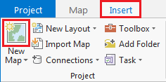
Creating a New Map
A map is a project item used to display and work with geographic data in two dimensions. The first step to visualizing any data is creating a new map.
- On the ribbon, click the Insert tab.
- In the Project group, click the New Map button.
You will notice that a new map view opens in the main section of ArcGIS Pro.
The panel on the left side of ArcGIS Pro is called the Contents pane. After creating a new map, the Contents pane now displays the default Map title and automatically adds the Topographic basemap layer to the map.
The panel on the right side of ArcGIS Pro is called the Catalog pane. After creating the first map, a new Maps section has been added to the top of the Project tab within the Catalog pane.
- In the Catalog pane, click the arrow to expand the Maps section.

Notice that there is a single map there, named "Map". Since most projects will have multiple maps, it is a good idea to name your maps with more descriptive titles.
- In the Catalog pane, under the Maps section, right-click Map and select Rename.
- Type "Wastewater Outfalls" and hit Enter.
Saving a Project
Any time you create a new project item, such as a map or a layout, or any time you spend time adjusting the symbology of your map layers, it is a good idea to save your project.
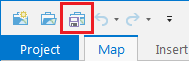
- Above the ribbon, on the Quick Access toolbar, click the Save button.
Managing GIS Data
- In the Catalog pane on the right, expand Folders > CEVE101 > CEVE101.gdb. There are currently no data in this folder.
- Right-click Folders and select Add Folder Connection.
- In the left column click Computer. in the right column double click C: > Users > gistrain. Single click Downloads and select OK.
- In the Catalog pane, expand Downloads.
- Fully expand all folders and geodatabases in the Downloads folder.
- Drag and drop the Major_Rivers feature class into the CEVE101.gdb
- Repeat drag and drop for Wastewater_Outfalls
- Right-click the CEVE101.gdb and select Import > Feature Class

- Click the Browse button to navigate to input features. In the left column click Folders. In the right column click Downloads > Census_2010_By_SuperNeighborhood. Single click Census_2010_By_SuperNeighborhood.shp
- Type SuperNeighborhoods into the Output Feature Class bar.
- Click Run.
- In the Catalog pane, expand the CEVE101.gdb. There are now three feature classes contained within: Major_Rivers, SuperNeighborhood, Wastewater_Outfalls

- Right-click on the Downloads folder. Select Remove.
Adding Data to a Map
- In the Catalog pane on the right, right-click the Census_2010_By_SuperNeighborhood feature class and select Add To Current Map.
- An alternative method of adding data to a map is to click and hold the Major_Rivers feature class and drag and drop it into the Super Neighborhoods map view.
- Repeat either method to add Wastewater_Outfalls to the map view.
Symbolizing Layers with a Single Symbol
It is early in the project to be deciding upon symbology, however, when layers are added to a map, ArcGIS Pro assigns then a random color symbol. Sometimes the colors are very faint and difficult to see on top of the basemap or the colors of multiple layers are very similar to each other and difficult to distinguish. To ensure that everyone can easily see the layers we are working with, we will adjust the basic symbology.
- In the Contents pane, right-click the Major_Rivers layer name and select Symbology to open the Symbology pane on the right.
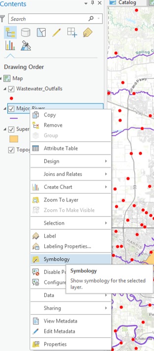
Notice that the 'Primary symbology' defaults to Single Symbol. With this type of symbology, all features in that particular layer will be assigned the same symbol.
- For 'Symbol', click the colored line symbol to switch to Format Line Symbol mode.

- Within Format Line Symbol mode, click the Properties tab.
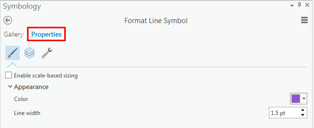
- For 'Color', use the drop-down menu to select Cretan Blue.
- At the bottom of the Symbology pane, click Apply.
The rivers on the map should now all be blue and easily visible on top of the basemap. The Format Symbol mode of the Symbology tab can be accessed directly via the layer symbol (instead of the layer name) in the Contents pane.
- In the Contents pane on the left, click the colored rectangle symbol beneath the Census_2010_By_SuperNeighborhood layer name.

- On the right in the Symbology pane, for 'Color', use the drop-down menu to select Mango.
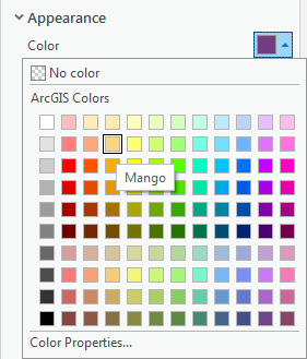
- For 'Outline color', use the drop-down menu to select Gray 50%.
- At the bottom of the Symbology pane, click Apply.
- In the Contents pane on the right, right-click the colored point symbol beneath Wastewater_Outfalls layer name. Select Mars Red.

The super neighborhood polygons are now easy to distinguish from both the basemap and the rivers, while the wastewater outfalls are highly visible in red.
Navigating the Project
Navigating the Contents Pane
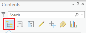
At the top of the Contents pane, there is a series of seven buttons. By default, the leftmost button is selected: List by Drawing Order.
When this button is selected, the order in which the layers are listed corresponds to the order in which the layers are visually stacked in the Map view. To test how the drawing order works, you will reorder the layers.
- In the Contents pane, click and hold the Census_2010_By_SuperNeighborhood layer name and drag and drop it above the Major_Roads layer.
You will notice that, in the Map view, the Census_2010_By_SuperNeighborhood layer is now drawn in on top of the Major_Roads layer, meaning that freeways are only visible in areas not covered by a super neighborhood. It is possible to add transparency to the super neighborhood layer or to symbolize it with a bold outline and a hollow fill, but, in general, it is best to have polygon layers at the bottom of the drawing order, so we will return the layers to their previous order.
- In the Contents pane, click and hold the Census_2010_By_SuperNeighborhood layer name and drag and drop it beneath the Major_Roads layer, but above the Topographic basemap.
Because the basemap is a solid image, any layers beneath it will not be shown at all, so ensure the basemap is always at the bottom of the layers in the Content pane.
The check boxes to the left of each layer name toggle the visibility of each layer.
- Uncheck the Major_Roads layer to turn off its visibility in the map view.
- Check the Major_Roads layer to turn its visibility back on in the map view.
Navigating the Map View
You will now learn how to navigate the Map view by panning, zooming, and using spatial bookmarks.
- On the ribbon, click the Map tab.
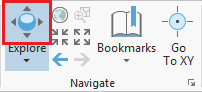
- in the Navigate group, ensure that the Explore button is selected by default.
To pan the map:
- Within the map view, click and hold the left mouse button and drag the mouse and release.
To manually zoom:
- Hover your cursor over the area you wish to zoom in to and push the center scroll wheel away from you for incremental zooming. Pull the center scroll wheel towards you to zoom out.
-OR-
- Hover your cursor over the area you wish to zoom in to, hold down the right mouse button, and drag the mouse down for smooth zooming. Drag the mouse up to zoom out.
-OR-
- Hold down Shift such that your cursor changes to a magnifying glass and then click and hold and drag a box around the targeted area of interest to zoom directly to a specific extent.
To zoom to the extent of a particular layer:
- In the Contents pane, right-click the Census_2010_By_SuperNeighborhood layer name and select Zoom To Layer.
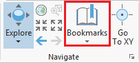
A spatial bookmark allows you to quickly return to a particular zoom extent in your Map view.
- On the Map tab, in the the Navigate group, click the Bookmarks button and select New Bookmark....
- In the 'Create Bookmark' window, for 'Name:', type "Houston" and click OK.
- To test the bookmark, use panning and zooming to change the extent of the map.
- Again, click the Bookmarks button and this time select the Houston bookmark to return to that extent.
Exploring Data in the Map View
Selecting Features Manually
Selecting Features Manually from the Map View
- On the Map tab, in the Selection group, click the Select button.

- In the map view, click on any neighborhood to select it.
The selected neighborhood will be outlined in cyan.
- Drag a box to select multiple adjacent neighborhoods.
- Hold down Shift and click any non-selected neighborhood to add additional non-adjacent neighborhoods to the selection.
- Hold down Ctrl and click any selected neighborhood to deselect neighborhoods.
When you are finished using a selection, it is important to clear the selected features, because the majority of tools in ArcGIS Pro only run on selected features. Therefore, if you run a tool anticipating that you will be processing all features in a particular layer and you inadvertently left some features selected from a previous process, only those selected features will be processed, which will lead to unexpected results.
- On the the Map tab, in the Selection group, click the Clear button to clear the selected features.
![]()
Notice that the Clear button becomes grayed out once all features are cleared. On the Map tab, notice that the Select button is still activated, which means that if you now attempted to pan the map by clicking and dragging your left mouse button across the map, you would, instead, select numerous features on your map inadvertently. To prevent this, it is a good idea to reactivate the Explore button as soon as you are finished using manual selection.
- On the Map tab, in the Navigate group, click the Explore button.
Selecting Features Manually from the Table View
- In the Contents pane, right-click the Census_2010_By_SuperNeighborhood layer name and select Attribute Table.
A table view now appears docked beneath your map view. Each row, or record, in your table corresponds to exactly one super neighborhood polygon on the map. Each column, or field, in your table represents a variable describing the super neighborhoods.
Every geodatabase feature class has two to four default fields, which cannot be edited or deleted. The leftmost OBJECTID field is a unique ID that is automatically numbered from 1 to the total number of features at the time of creation. In this particular case, the field is called OBJECTID_1, because there was a preexisting OBJECTID field at the time this data was imported to geodatabase format by the City of Houston. The Shape field indicates whether the feature geometry contains points, lines, or polygons.
- In the table view, use the scroll bar at the bottom to scroll to the far right of the table.
The other two default fields are the last Shape_Length and Shape_Area fields which contain the perimeter and area of the super neighborhoods, respectively. A line feature class will only contain the Shape_Length field and a point feature class will not contain either field. The units of these fields correspond to the units of the projection in which the data coordinates are stored.
- In the Contents pane on the left, double-click the Census_2010_By_SuperNeighborhood layer name.
- In the 'Layer Properties' window, in the left column, click the third Source tab.
- At the bottom of the window, click to expand the Spatial Reference section.
- Use the scroll bar on the right to scroll to the bottom of the metadata.
Within the Spatial Reference section, notice that the geographic coordinate system is WGS 1984 and that no projected coordinate system is listed. Therefore, the layer is unprojected, meaning the data coordinates are located on the three-dimensional surface of the globe and you can see the Angular Unit is listed as Degrees (or decimal degrees.) Therefore, the Shape_Length field is displaying decimal degrees and the Shape_Area field is displaying square decimal degrees, which is why the numbers are so low. Before measuring distance or area, the data layer should be projected onto a two-dimensional surface. The resulting projection will have a Linear Unit, such as feet or meters. The process of projecting is further covered in the Introduction to Coordinate Systems and Projections course.
As indicated by the layer name, the majority of the remaining fields contain 2010 census data that was aggregated to the super neighborhood level by the City of Houston, since that is not a geographic unit at which the Census Bureau provides data.
- Double-click the 'Name' field header to sort the neighborhoods alphabetically.
- To select a neighborhood from the table, click the gray square to the far left of each row.
- To select an adjacent section of records, hold down Shift and select a record below or above the currently selected record to automatically select all records in between.
- To add or remove individual records from the selection, hold down Ctrl and select another record.
Notice in the bottom left corner of the Census_2010_By_SuperNeighborhood attribute table, it indicates the number out of 88 table records (and corresponding map features) that are currently selected.
The two buttons to the left allow you to toggle between 'Show all records' and 'Show selected records'.
Note that if 'Show selected records' is active and no records are currently selected, the table view will appear empty. Toggle back to 'Show all records' to view the table.
- At the top of the Census_2010_By_SuperNeighbrhood table view, click the Clear button.

- Close the attribute table.

Symbolizing Layers By Attributes
Symbolizing Layers By Quantity
- In the Contents pane, right-click the Census_2010_By_SuperNeighborhood layer name and select Symbology.
- Use the primary 'Symbology' drop-down menu to select Graduated Colors.
- Use the 'Field' drop-down menu to scroll down sixth from the bottom and select the SUM_Vacant field. This field stores the number of vacant housing units within each neighborhood.
The map view now displays a choropleth map, where the darker colors represent higher numbers of vacant housing units. In studying the map, it appears as if the most vacant housing is in southwest Houston outside the Loop. While this is true according to raw counts per neighborhood, there could be differences in the neighborhoods that are unaccounted for in this symbology. Now you will try normalizing by the area of the neighborhood.
- Use the 'Normalization' drop-down menu to scroll to the bottom and select the last Shape_Area field.
As discussed in the Introduction to GIS Data Management course, the projection of the census layer is WGS 1984. Therefore, the layer is unprojected and the coordinates are stored in angular units of decimal degrees. Therefore, the Shape_area field is displaying square decimal degrees and the map is displaying number of vacant housing units per square decimal degree. This is a somewhat incomprehesible unit, however, the values are still proportional to how they would be in a different unit and the relative coloring on the map remains correct. If you wanted to make a map that displays vacant housing units per square mile, then you would add a new field to the attribute table and use the calculate
projecting is further covered in the Introduction to Coordinate Systems and Projections course.
Notice that according to the density of vacant housing units, the greatest amount of vacant housing units appear to be both inside and outside the loop along 59.
- Use the 'Normalization' drop-down menu to select the SUM_HU100 field.
The map is now displaying the number of vacant housing units divided by the total number of housing units, or the percent vacant housing units. While all three methods of symbolizing the vacant housing units are techically corect This is probably the most common
- On the lower half of the Symbology pane, click the Histogram tab.
----------------------------------------------------------------------
Discuss and test classification methods.
----------------------------------------------------------------------
- Use the 'Method" drop-down menu to select Equal Interval.
- Use the 'Method" drop-down menu to select Quantile.
----------------------------------------------------------------------
Discuss and test number of classes.
----------------------------------------------------------------------
- Use the 'Classes' drop-down menu to select 20.
- Use the 'Classes' drop-down menu to select 4.
----------------------------------------------------------------------
Discuss and test color schemes.
----------------------------------------------------------------------
Adding Layer Transparency
- Ensure that the Census_2010_By_SuperNeighborhood layer is selected.
- In the ribbon, click the Feature Layer contextual Appearance tab.
- In the Effects group, slide the Layer Transparency slider or type "50" and hit Enter.
Symbolizing Layers By Category
- Use the primary 'Symbology' drop-down menu to select Unique Values.
- Use the 'Field 1' drop-down menu to select Name.
- In the Contents pane, collapse the Census_2010_By_Superneighborhood symbology.
----------------------------------------------------------------------
zoom into neighborhood, go to explore button, click on neighborhood to find out neighborhood name.
----------------------------------------------------------------------
Selecting Features Programatically
Selecting Features By Attributes
- In the ribbon, click the Map tab.
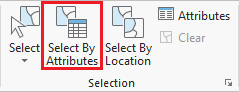
- In the Selection group, click the Select By Attributes button to open the Select Layer By Attribute tool in the Geoprocessing pane.
- In the Geoprocessing pane, click the Add Clause button.
- Use the drop-down menus to build the following expression: Name is Equal to 'YOUR_NEIGHBORHOOD_NAME' and click the Add button.
- Ensure your Geoprocessing pane appears similar to that below and click Run.
Exporting Selected Features
- In the Contents pane, right-click the Census_2010_By_SuperNeighborhood layer name and select Data > Export Features.
- In the Geoprocessing pane, click the 'Output Feature Class' field to edit the name. Replace Census_2010_By_SuperNeighbor with "MyNeighborhood". Ensure that you leave everything in the file path through Intro.gdb\.
Selecting Features By Location
Now we will create a map of the bus stops and bus routes within your neighborhood. We could continue to do our mapping within the existing map, but, since we are now focusing on different thematic layers in a different geographic extent, this could be a good time to create a second map within our project.
- On the ribbon, click the Insert tab.
- In the Project group, click the New Map button.
- At the bottom of the Geoprocessing pane, click the Catalog pane tab.
- Rename My Neighborhood and add MyNeighborhoods, BusStops and BusRoutes.
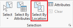
- In the Selection group, click the Select By Location button to open the Select Layer By Attribute tool in the Geoprocessing pane. Select bus stops within neighborhood.
- Select bus routes within 100 ft of bus stop in neighborhood.
Presenting and Sharing Maps
Creating a Layout
Once you are finished with your analysis, you may want to create a map that is suitable for adding to a report, presentation, or sharing with others who don't have access to ArcGIS software.
- On the ribbon, click the Insert tab.
- Click the New Layout button.
- If you wanted to create a custom image size for insertion into a report or presentation, you could select Custom pages size... at the bottom of the options, but for a full page layout, select Letter 8.5" x 11" at the top left of the options.
More tips for creating a layout are covered in the Map Layouts for Publication short course.
Exporting a Layout
- On the ribbon, click the Share tab.
- Click the Export Layout button.
- On the left, click the Desktop folder.
- Double-click the Intro folder.
Discuss export file types and resolutions.
- For 'Resolution (DPI)', type "300".
- Click Export.
To continue learning intermediate topics, refer to the courses in the other ArcGIS Pro Series.